Share this article
Halloween decorations are popping up at retailers all over the country, but something far more insidious than plastic skeletons and glow-in-the-dark witches is lurking on the internet… and it’s scaring donors everywhere.
I’m talking about frightening nonprofit websites.
Here are some ways to tell if your organization’s website is scaring away your donors. Click on the links below to jump to any of these spooky topics!
- Your page includes auto-playing video or sound elements.
- It includes mobile pop-ups.
- It’s impossible to navigate.
- It looks dated.
- It’s a wall of text.
1. Your page includes auto-playing video or sound elements.
Nothing is more alarming than browsing the Internet and being startled by a loud, noisy webpage. It’s especially annoying if you’re already listening to something else (like a podcast) or if you’re in a quiet area (like a library or work space).
Including an auto-playing element on your page, whether it’s an embedded video or a sound clip, is a surefire way to spook your donors.
In a best-case scenario, donors scramble around your page trying to turn it off. In a worst-case scenario, they leave your site entirely. Don’t risk it—if you include a video or other element on your page, make sure it’s not set to play automatically.

2. It includes mobile pop-ups.
Pop-ups are pretty universally considered to be annoying. But they can be so tempting sometimes—you can promote your newsletter! Or your event! Or a cool new piece of content!
However, pop-ups are a great way to scare away your donors… especially if they’re accessing your page on a mobile device.
Mobile pop-ups are the worst. They’re hard to exit, they’re distracting, and they’re generally off-putting. If you don’t want to scare away your donors, ditch the pop-ups.
3. It’s impossible to navigate.
If your donors can’t find the link they want in 3-5 seconds, they’re probably not going to stay on your page. A hard-to-use page is a donor’s kryptonite and is a guaranteed way to run off potential supporters.
Want to see if your page is easy to navigate? Try recruiting a friend or family member to use your page. Don’t guide them through the navigation—if they struggle, you need to re-work your page.
To fix poor navigation, you should look at simplifying the content that’s included in your top navigation bar. Not every piece of content needs to have a place in your navigation. While it might seem helpful to include everything, too much content can confuse donors and make it hard for them to find what they’re looking for.
The same goes for your copy: keep things simple. Don’t use complicated jargon or industry terms that your donors might not understand. When your navigation is straightforward and concise, donors can easily scan through the content and find what they’re looking for.
If you follow these website design best practices, you’ll have a site that’s organized in a way that makes sense to your donors.
Bonus: Want more help with your nonprofit’s navigation? Look at this list of top professionals to help design your website.

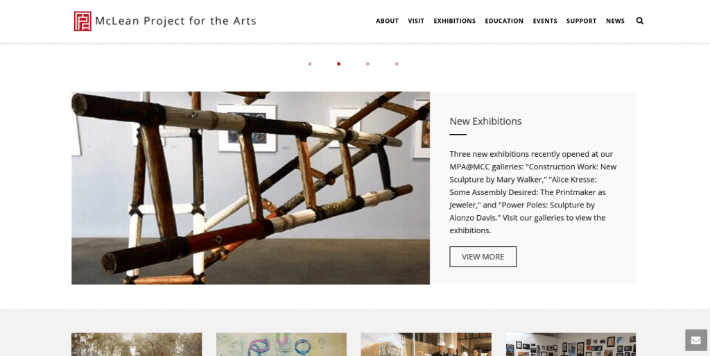
4. It looks dated.
Outdated websites are today’s bogeymen, especially for young donors. A recent survey shows that 3 out of 4 Millennial donors are turned off by outdated websites. Nonprofits can’t afford to scare away 75% of young donors, especially since Millennial and Gen X donors are set to overtake the Baby Boomers as the largest pool of donors within the next few years.
How can you tell if your website is outdated? Some good clues are clip-art graphics, flashing animations, weird backgrounds, dated fonts, and pretty much anything you’d see on a 1990s Geocities site.
Modern websites are generally more sleek and streamlined. Plenty of white space surrounds content, fonts are crisp and clear, and minimalism is king.
Check out this example of a modern website from McLean Project for the Arts:
Check out this list for more examples of modern nonprofit websites!
5. It’s a wall of text.
Nobody wants to read a novel before making a donation. There’s something psychologically intimidating about a page of solid text, and donors are more likely to leave your page than try to comb through it.
To eliminate huge chunks of text, try relying on powerful, emotional photos to convey your message—after all, a picture is worth a thousand words—and supplement them with short paragraphs and lines of text. A good rule of thumb is to keep paragraphs to 5 lines or fewer.
If you do have to write several paragraphs, try using white space, photos, block quotes, bullets, and bolding to break up your copy. Just remember not to go overboard.
We covered some web design don’ts, but what about web design do’s? Check out this resource for more nonprofit web design tips.
You might enjoy

Donor segmentation: how to power stronger communications
Donor acquisition and retention

15 sponsorship letter templates to spark new partnerships
Donor acquisition and retention

How to write a meaningful donor thank-you letter
Donor acquisition and retention