Share this article
Your nonprofit donation page is a crucial tool for gaining and keeping new donors for your organization. Online donating is far and away a donors’ favorite method, with 63% of donors saying they prefer to give online with a credit or debit card.
Figuring out how to make the best donation page for your organization may seem tricky, but luckily, there are some valuable tips to help you create and design a great one:
- How to set up a donation page
- Donation form best practices
- Donation page best practices
- Benefits of a donation page
- Our favorite donation page examples

How to set up a donation page
With today’s robust, user-friendly fundraising tools, building a donation form and page for your nonprofit is easier than ever.
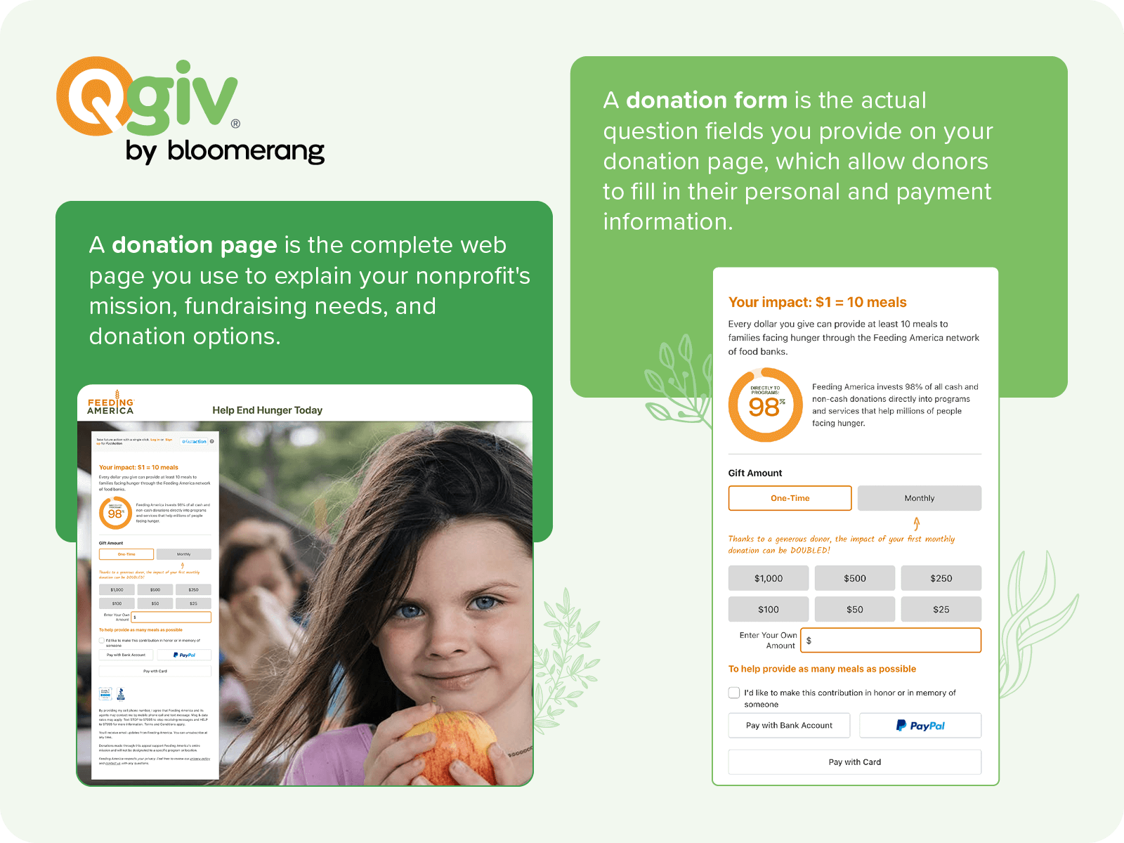
First, let’s explain the difference between a donation form and a donation page.
Donation form vs. donation page
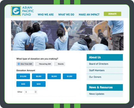
Your donation page is the complete web page you use to explain your nonprofit’s mission, fundraising needs, and donation options. It usually includes header text, an image or two, your donation form, and a submit button.
On the other hand, your donation form is the actual question fields you provide on your donation page, which allow donors to fill in their personal and payment information. The form is one of the most essential elements of your overall donation page because its design can influence whether donors actually give.
Follow these steps to learn how to set up a donation form and page with our preferred solution, Bloomerang Fundraising.
1. Select a platform to build your donation page.
Online fundraising software will make constructing your own donation pages much less stressful, and you’ll be able to create optimized forms that drive giving. Search for a fundraising platform that enables:
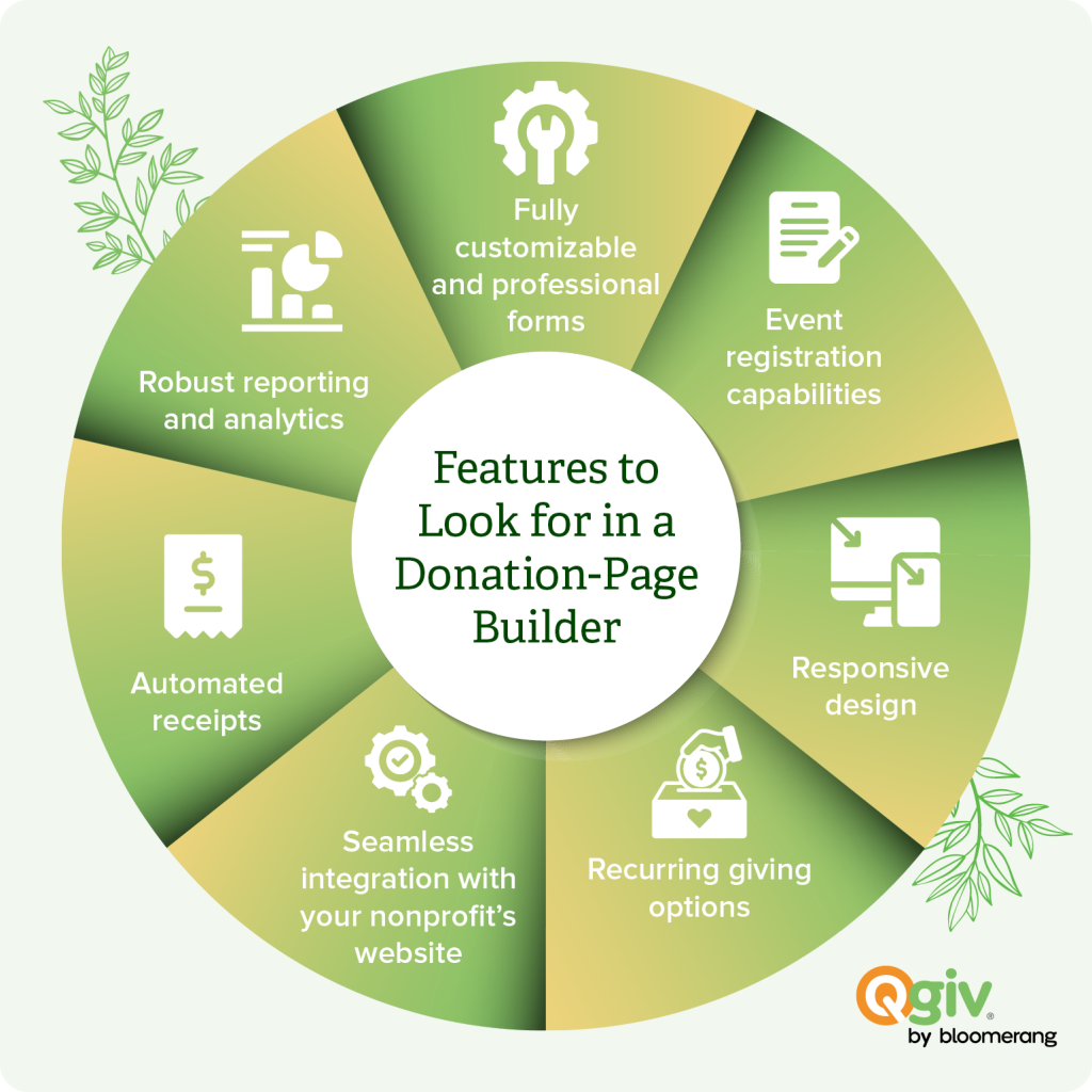
- Fully customizable and professional forms. Build unlimited donation pages and customize them with ease.
- Event registration capabilities. Your donors can donate and RSVP to your events in one convenient step.
- Responsive design. Your forms will look great and be accessible on every device.
- Recurring giving options. Place a recurring giving option on your form to see higher donor retention rates.
- Seamless integration with your nonprofit’s website. Easily include your form on your nonprofit’s website and collect new donor data.
- Automated receipts. Automate receipts after your donors have given so your organization has one less thing to worry about!
- Robust reporting and analytics. Track the performance of your form and adjust it to improve your fundraising.
Our recommended donation page platform: Bloomerang Fundraising
To simplify your search for the right giving platform, we’ll highlight features of our preferred option: Bloomerang Fundraising. This solution offers all of the features and benefits listed above, along with a few special features, including:
- GiftAssist, a feature that gives donors the option to cover processing fees
- A campaign thermometer to gamify your fundraising efforts and encourage donors to give more to help reach your fundraising goals
- Customizable dashboards and reports to easily view the data that’s most important to your organization
- Integrations with other leading software solutions, including Constant Contact and Google Analytics
Bloomerang makes the giving process easier for both your nonprofit and your donors. Your nonprofit’s team can leverage a user-friendly platform to easily design branded, mobile-friendly donation pages. At the same time, your donors can quickly show their support using a giving form that’s tailored to their needs. It’s a win-win for everyone involved!
2. Map out your donation form’s structure.
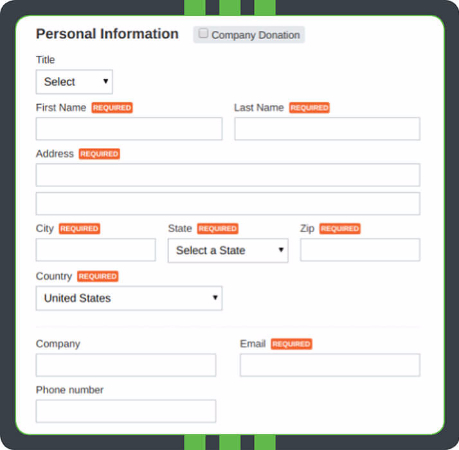
You should have a clear plan in place before designing your donation form. Know exactly which fields and questions you must include and how to order them intuitively. Your form should be logical and cohesive, and the only way to ensure that is by creating a plan before you start building it.
Approach your donation form’s design and structure strategically by incorporating these tips into your plan:
- Order information logically. Ask for personal information like name and address first so your donors can introduce themselves. Then, move on to the nitty gritty details like shipping options and payment processing. Move optional fields closer to the bottom so they don’t obstruct the required fields.
- Keep it simple. Your donors are busy people! Studies show that 83% of people who visit your donation page don’t actually make a donation. In other words, the shorter and easier your form is to complete, the more your donors will actually make it to the end and submit their donations. While it can be tempting to use your form to collect as much information on your donors as possible, keep the required fields and questions to an absolute minimum. If you wish to contact your online donors further, do so through email newsletters, periodic surveys, and other communications.
- Reduce repetitive information. If your donation form has fields that might overlap, design it so that your donors don’t repeat information. A common example is shipping and billing addresses. Most online donation forms allow you to place a checkbox on your form that donors can click to autofill their billing information if it’s the same as their shipping address.
Making your giving form simple and easy to fill out creates a pleasant donor experience that will result in more donations down the road.
3. Design and brand the donation page.
Your donation page is a reflection of your nonprofit, so it should be both functional and beautiful! In fact, according to our generational giving report, 33 percent of Generation X donors say they’re put off by outdated websites.
Styling your page with fonts, colors, images, and more not only enhances the donors’ giving experience but also keeps your donation page looking fresh and modern. Additionally, a well-designed form enhances its professionalism and authority, which establishes more trust with your donors.
Brand your form to your organization using easy-to-read fonts, professional-quality images, and complementary colors. To motivate your donors visually, add a fundraising thermometer for specific donation campaigns.
4. Enable multiple payment options.
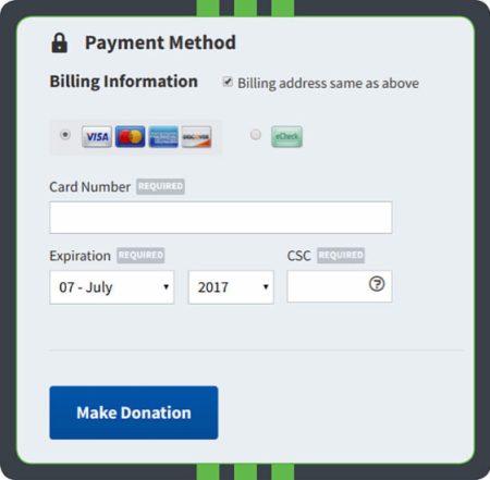
Giving your donors multiple options to make their donations online is vital to enhancing the online giving experience. Including a variety of payment options will make giving more convenient for your donors, allowing them to choose the option that’s most convenient for them.
On your form, list all the payment methods your nonprofit accepts. For example, include icons of all the credit cards you can process, and give your donors the option to donate through eChecks or digital wallets as well. While the number of options included will depend on your organization’s resources, the most important thing is to make these options clear!
Additionally, you should use online giving software with a secure payment processor to keep your donors’ sensitive information safe. Ensure your platform has security credentials, such as PCI compliance.
When you ensure your page is 100% secure, you’ll give your donors and your nonprofit peace of mind, knowing that confidential information is kept safe. Donors will be far more likely to give to your organization if they know your nonprofit has taken every security precaution.
5. Optimize your donation thank-you page and receipt.
Your relationship with your donors doesn’t end the minute they click the “Submit” button.
After your donors make a gift, set up your online giving software so they land on a branded acknowledgment page. You can also automate donation receipts so your donors will always be certain that you’ve received their gifts.
With Bloomerang, you can use tags within your customizable receipts to automatically include your donor’s name on their receipt to add a personal touch. You can also add a conditional thanks for any of your donors who used GiftAssist to cover their donation’s processing fee for you.
Building relationships with your donors is crucial for your retention efforts, so use your donation form as part of your stewardship plan!
6. Monitor your page’s success.
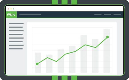
To maximize success through online giving, monitor your donation page regularly to see how it’s performing. Monitoring your donation form is the only way to pinpoint areas for improvement so you can hone your online giving strategies.
Use your online giving platform to run various reports to see how your donation page performs. Evaluate metrics such as:
- Conversion rate
- Average gift size
- The rate at which donors choose recurring giving options
- How much of your total giving comes from your online donation form
These reports provide you with deeper insights into your donors’ preferences and where you can improve the online donation experience. Pay attention to the patterns you see and adjust accordingly!
D
onation form best practices
By following the steps above, you’ll be well on your way to designing a solid donation page that supports your online fundraising goals. But it never hurts to put a few finishing touches on the form and page that will take your efforts to the next level! Use these donation form best practices to impress your donors and drive even greater results.
Ensure the form is mobile-optimized.
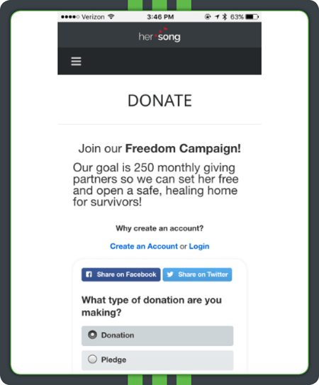
In 2023, most nonprofit website traffic came from mobile devices (52%). To reach all of your donors wherever they might be, your donation page needs to look just as appealing and be just as easy to use on a mobile device as it is on a laptop or desktop.
Most online giving software will automatically generate a mobile-responsive version of your online donation page for you, so if you’re using software, you’ll have one less thing to worry about!
However, it’s still best to design with mobile in mind. Use large text and buttons and keep your layout vertical to ensure your page will look amazing on phones and tablets.
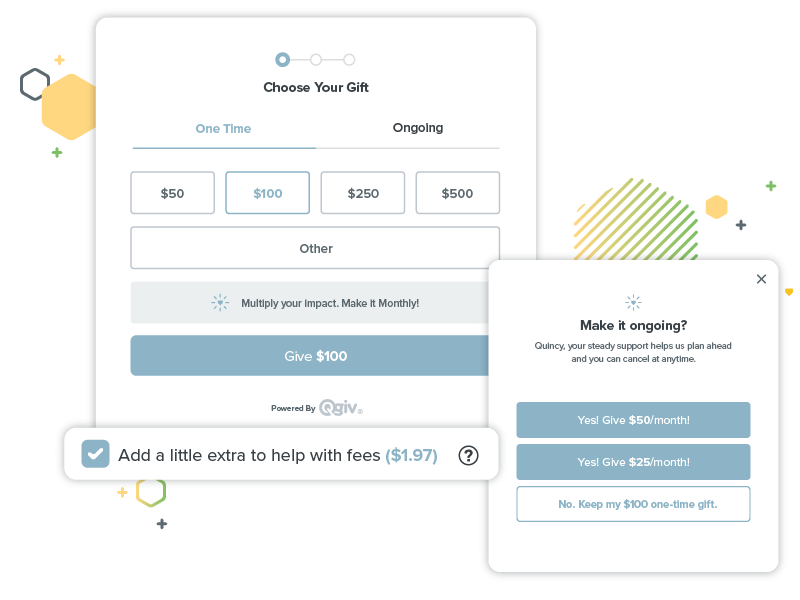
Offer giving suggestions.
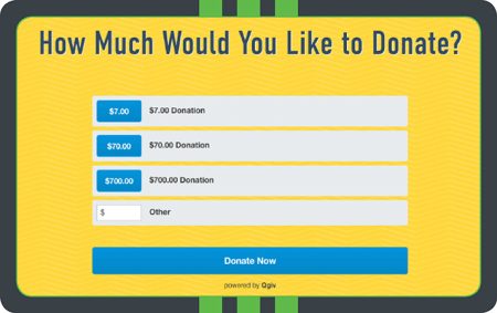
Offering different giving suggestions makes giving more convenient for supporters and can even result in higher donations. For example, donors may arrive on your page intending to give a smaller amount but choose a larger option from your preset list of giving suggestions instead.
When setting gift amounts, factor in your campaign goals, your donors’ average gift sizes, and the gift amounts featured on comparable donation forms to set gift levels appropriately. Let your donors know exactly how they can further your cause by linking each gift amount with quantifiable results. For instance, tell donors that a $20 donation helps purchase a new leash for a shelter dog, while $200 can purchase a month’s worth of dog food.
Enable recurring donations.
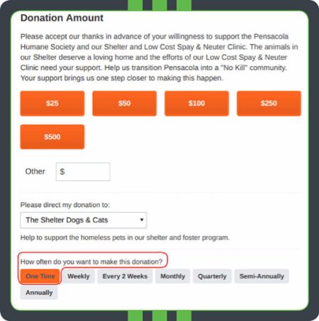
Recurring donors are some of the most lucrative contributors for nonprofits! Think about it: A donor who gives regularly can donate much more to your nonprofit than a one-time donor possibly could. However, not all of your donors will know how to set up recurring giving. By encouraging recurring gifts on your donation form, more of your donors will be aware of this option, and they’ll have a convenient way to get set up.
With online giving software, your nonprofit can empower donors to set up recurring giving via a field on your form. Provide donors with multiple options (for example, monthly or annually) so they can choose the option that’s most convenient for them. When donors have the flexibility to choose their own involvement, they’ll be more likely to become longtime givers!
Provide matching gift options.
Did you know that an estimated $4-7 billion in matching gift funds go unclaimed each year? This is not only due to donors not knowing if they’re eligible but also because many organizations don’t promote matching gifts enough. Adding a matching gift option within your online donation form will help increase your fundraising.
A simple way to advertise matching gifts within your donation form is to include a matching gift search tool on the form. Your donors can quickly look up their employer to see if they’re eligible and receive the necessary guidelines and forms for their company’s program.
Donation page best practices
Along with your donation form, the overall vibe of your donation page is essential in helping donors decide whether to give. Use these tips to optimize the full page to support your conversion efforts.
Maintain consistent branding.
Branding creates consistency, which is key to establishing trust with your donors. Using a donation form that doesn’t match the rest of your website can create confusion and leave your donors wondering if they’re actually giving to your organization. In other words, using a branded form will make your donors feel more comfortable about giving.
When designing your form, it should reflect the look and feel of your organization’s website. Use the same color scheme, imagery, font, and language as you would throughout the rest of your site. Additionally, include your logo in the top left corner so your donors can immediately be sure that they’re using your nonprofit’s donation form.
Share your story.
Your supporters give to your organization because they’re passionate about your cause and care about your story.
That’s why along with your nonprofit’s About Us and Mission Statement page, your online donation page should reiterate your story. Reminding your supporters of why your cause is important can motivate them to continue giving or even increase their gift size!
Include your mission statement at the top of the page, and tell a story about how donations impact your larger mission. This way, your donors know exactly how your organization uses their gifts to help the ultimate cause.
Align donation amounts with tangible impacts.
Provide a tangible impact for each donation level to give your supporters a more concrete idea of how they are helping your cause and furthering your mission. Enabling donors to visualize exactly what their donations will do keeps them invested in your story.
When you’re creating your online donation form, make sure to indicate the tangible impact right next to each suggested giving amount. Be as specific as possible. For instance, instead of simply saying, “A gift of $20 will help the hungry,” you can say, “A gift of $20 provides people experiencing food insecurity with food, toiletries, and other necessities.”
Make your website’s “donate” button highly visible.
To provide the best user experience, your donation button should be visible to your donors on every page of your site. When your donors don’t have to search around for a button and can quickly access the pages they want, there’s a better chance they’ll stick around long enough to make a gift.
Your website’s “Donate” button should be prominently displayed across your site, not just on your ways-to-give page or homepage. To ensure it’s ever-present, include it in your top navigation so your donors can spot it immediately. Make your button even more eye-catching by making it large, using a bold font, and selecting a standout color from your brand palette.
Benefits of a donation page
Why should your nonprofit spend time creating a well-designed, compelling donation page? These online resources are essential for allowing donors to give at any time and anywhere, boosting your online giving conversion rates. Additional benefits of offering an impactful donation page include:
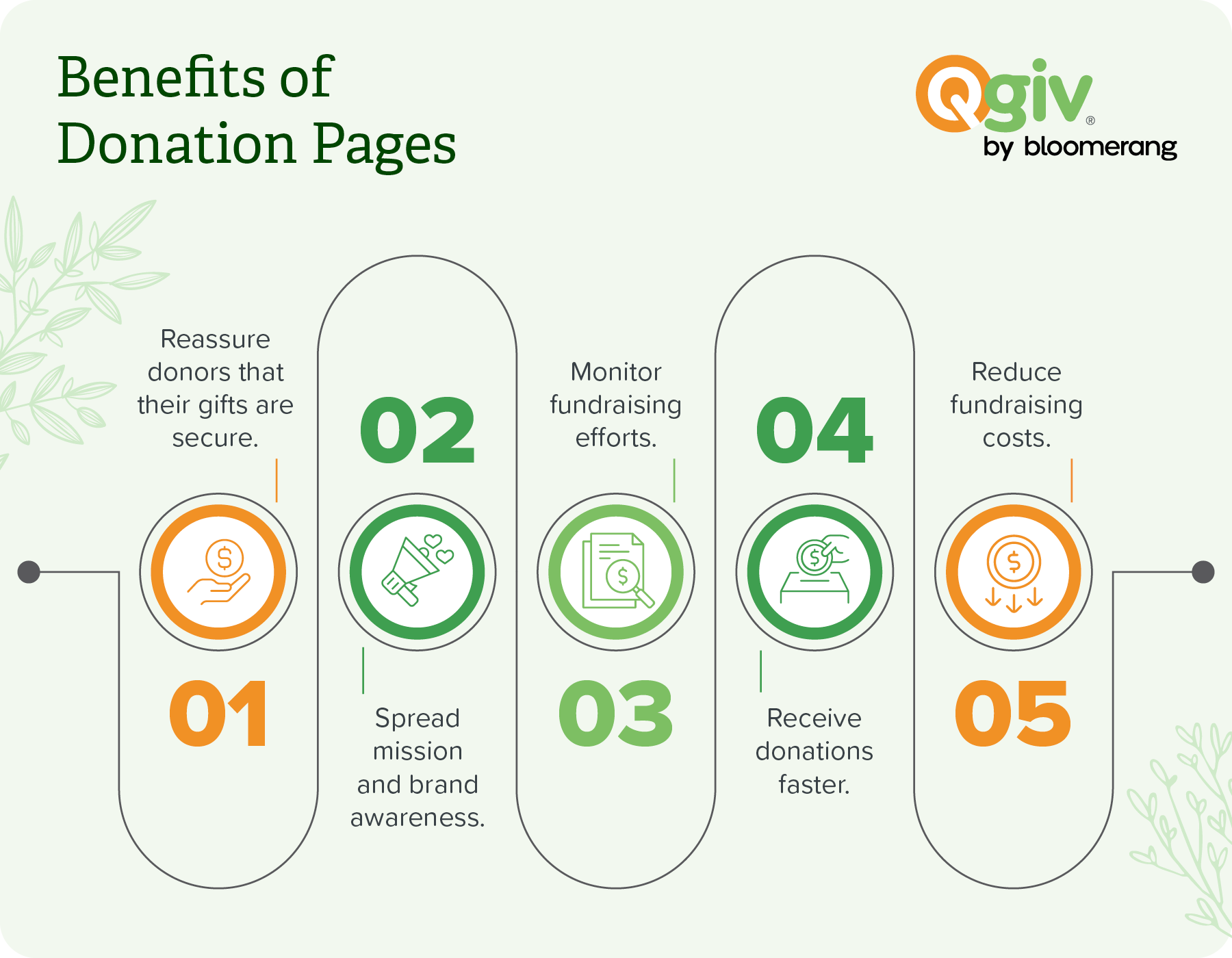
- Reassure donors that their gifts will be secure. With a PCI-compliant payment processing system, donors will feel more confident that their gifts will go directly to your cause without any security issues.
- Spread brand and mission awareness. Your online donation form allows you to tell your organization’s story through photos and a written description. By sharing this page across your email, social media, and other online platforms, you can spread awareness of your brand and cause to a wider audience.
- Monitor your fundraising efforts. An online fundraising platform, especially one that’s integrated with your nonprofit’s CRM, allows you to track how many online donations you receive and who they’re coming from. You can use your CRM to follow up with donors after they give, thank them, and invite them to engage with your organization in other ways, such as volunteering.
- Receive donations faster. Because your payment processor can instantly process online transactions, your organization can receive the donated funds much faster and immediately put them to use for your mission.
- Reduce fundraising costs. Online donation pages are relatively cost-effective to set up and maintain, especially compared to direct mail outreach, where the costs of physical materials can add up.
Your donation page will allow you to maximize your online fundraising efforts, turning your website into a well-oiled fundraising machine.
Our favorite donation page examples
When figuring out the best way to design your nonprofit’s donation page, it can be helpful to review effective examples from other organizations. We’ve compiled a list of our favorite donation page examples to help spark your creativity.
1. CROS Ministries
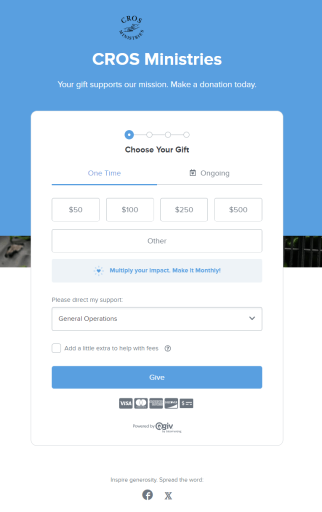
CROS Ministries offers donors a choice of where their money goes on their multi-step form. That way, they can control exactly what their hard-earned dollars support and better understand their impact.
Plus, donors can opt in to cover extra fees with Bloomerang’s GiftAssist feature. Once donors select a donation amount, the form updates to show them how much the fees cost. With this feature, CROS Ministries is transparent with donors about fees and makes it easy for donors to lend extra support with one click.
Through Bloomerang Fundraising’s donation page and payment processing tools, CROS Ministries raised over $152,000 in less than nine months and increased individual gifts by over 533%. As Gibbie Nauman, CROS Ministries’ Director of Development and Community Relations, puts it, “Why couldn’t I have found Bloomerang Fundraising five years ago when we were trying to figure out our next step post PayPal? I am just blown away with everything! It is amazing to see all of the donations coming through online, particularly from new donors, many of whom become recurring donors.”
2. Big Brothers Big Sisters of Beaver County
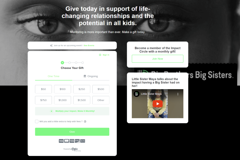
Big Brothers Big Sisters of Beaver County demonstrates the effect of branding on your donation page. The page includes bold brand colors and a video to demonstrate the impact of donations.
They also have a helpful call to action to join their monthly giving program. In addition to setting up an ongoing donation on the main form, donors have the option to click “Join Now,” where they can see more donation options, the impact they can have, and photos of real beneficiaries.
3. CARE
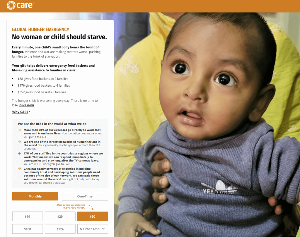
The CARE online donation page uses emotion to create a compelling pitch. By starting with the line, “Every minute, one child’s small body bears the brunt of hunger,” CARE quickly grabs donors’ attention and demonstrates need.
The hero image of a real child in need further appeals to donors’ emotions. Plus, the impact descriptions tell donors exactly how much different donation sizes will help beneficiaries, potentially encouraging them to choose a larger donation size than they had originally anticipated.
Lastly, CARE’s donation page clearly explains the organization’s value proposition and why it deserves donors’ support. Donors on the fence about the cause can quickly understand what CARE does, why they’re the best at it, and why donors should lend their support.
4. Junior Achievement of Arizona
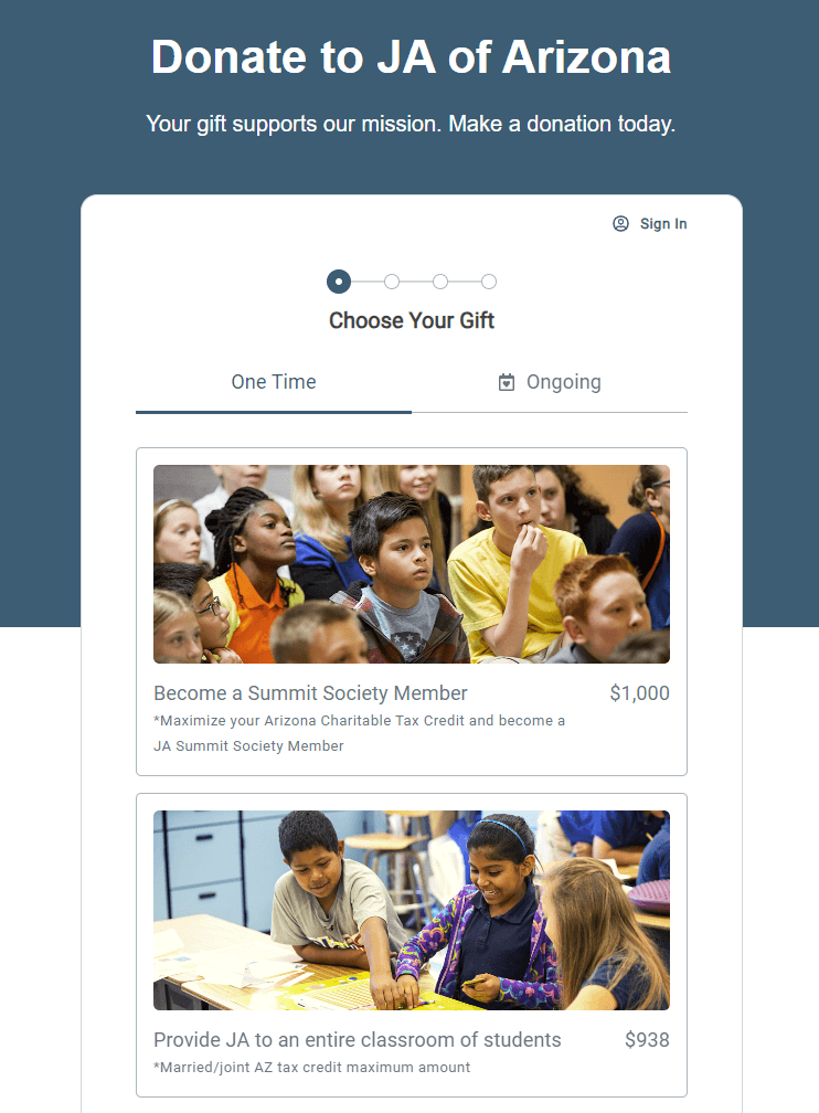
Junior Achievement of Arizona‘s donation page uses impact statements and images to show donors what their gift can accomplish. This formatting allows donors to see the exact impact of different donation sizes and may encourage them to give at higher levels.
As the page goes on, the gifts decrease in value, ensuring major, mid-level, and smaller donors can still understand the difference their funds make. For example, the top of the page indicates that a donation of $1,000 grants the donor acceptance into Junior Achievement of Arizona’s Summit Society, whereas the bottom of the page states that a donation of $37 enables one student to experience a JA program.
5. The ASPCA
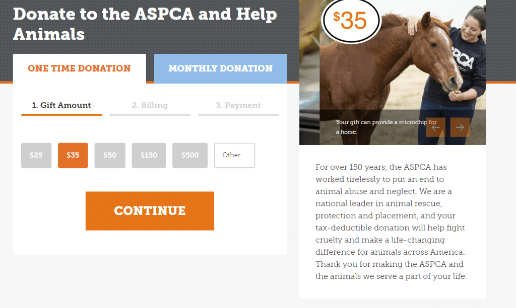
The ASPCA’s donation form also uses images and impact statements to describe the impact of different giving levels, linking dollar amounts to real outcomes. For example, the page indicates that a $50 donation can cover an animal’s foster supplies for a month, a $500 donation can provide a forensic exam with enrichment for three rescued dogs, and a $1,000 donation can provide a forensic exam with enrichment for 10 rescued cats. This specificity allows donors to imagine exactly how their donations will impact real animals and encourages them to follow through.
Additionally, high color contrast and large, readable fonts make this donation page mobile-friendly and accessible. For instance, when you click on the monthly donation button, it changes from blue with white text to white with orange text, indicating that you’ve jumped to a different page section. The donation amounts also change from gray to orange when you click on them, making it clear how much donors are committing to give before they continue.
6. Weld Food Bank
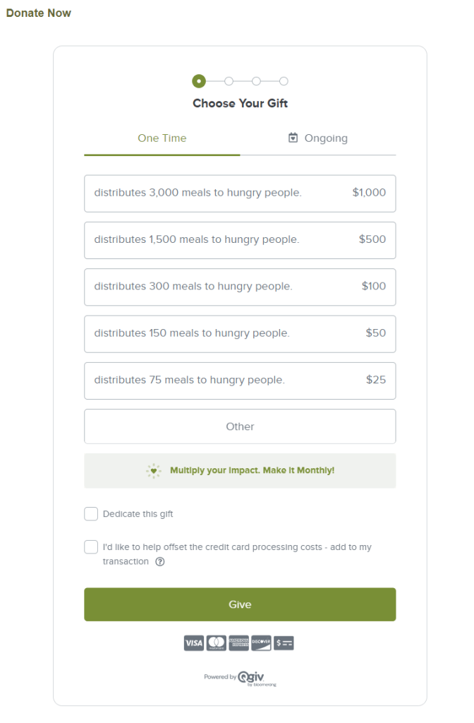
The Weld Food Bank donation page keeps users focused on giving with a simple form that offers GiftAssist. It also clearly displays the payment types accepted and demonstrates the impact of each donation amount by stating how many meals it will support.
Additionally, Weld Food Bank’s donation page includes a statement that donors’ gifts may be matched by their employers. Later in the donation process, donors can check their matching gift eligibility directly from the donation page and submit matching gift requests to expand their impact.
7. Feeding America
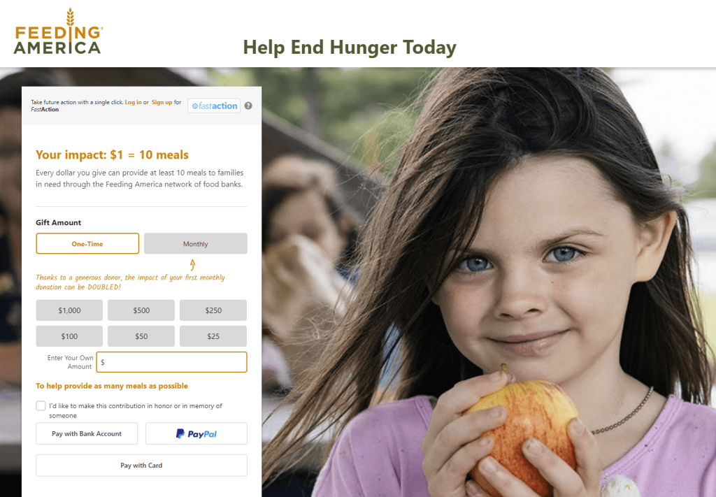
The Feeding America giving page clearly displays donors’ impact with a statement saying, “Your impact: $1 = 10 meals.” This shows donors exactly how their contributions will be used.
Additionally, Feeding America includes a statement that 98% of all cash and non-cash donations go directly to programs and services that help millions of people facing hunger. Donors can feel confident that their hard-earned dollars will go right to the beneficiaries who need them.
This donation page also encourages supporters to become monthly contributors by explaining that a generous donor has made it possible to double the impact of their first monthly donation. Knowing that another donor has given them a head start, other supporters may be enticed to increase their impact.
8. Humane Society of the Pikes Peak Region
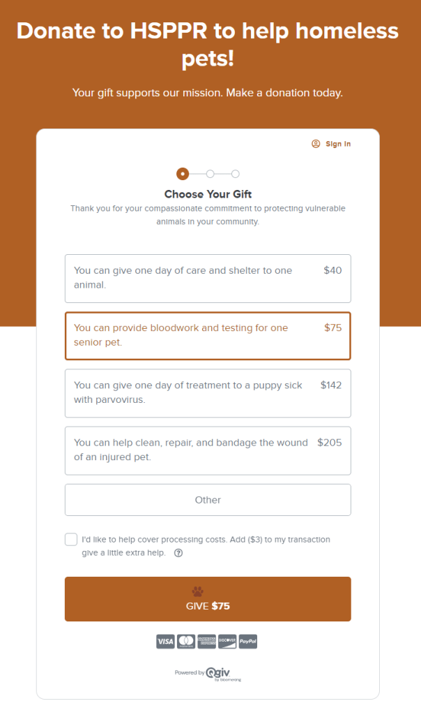
The Humane Society of the Pikes Peak Region adds a unique touch by customizing its “Give” button with a pawprint. The donation page’s suggested gift amounts each contain a specific description of how donations will help pets in need. Instead of explaining what each donation amount allows the organization to do, these descriptions put the donor’s impact at the forefront by using “You can” at the beginning of each statement.
This donation page also thanks the community for their support in protecting vulnerable animals. By leading with gratitude, the Humane Society of the Pikes Peak Region lets donors know that their support is meaningful and appreciated.
The Humane Society of Pikes Peak Region started working with Bloomerang Fundraising in 2020, when COVID-19 disrupted their typical marketing and fundraising efforts. After adopting Bloomerang’s donation form and fundraising tools, 2020 became HSPRR’s biggest year for online fundraising, raising over $637,000 and increasing individual gifts by over 64%.
9. St. Jude
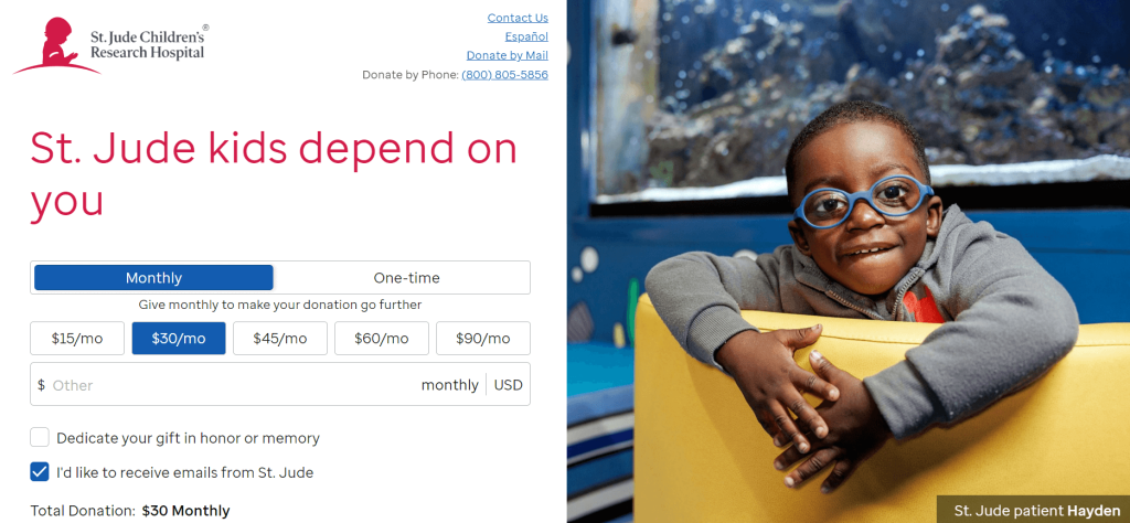
St. Jude Children’s Research Hospital allows donors to give in honor or memory of someone. Donors can transform their donations into memorials of their loved ones’ legacies.
This donation page also includes a frequently asked questions section that answers questions like “How does St. Jude use my online donation?” and “How can I manage my monthly donation?” With this information, donors can easily navigate the donation process and understand where their funds go.
Lastly, St. Jude’s donation page features accreditations from Charity Navigator and the Better Business Bureau. These badges confirm the donor is on the correct page and instill confidence in St. Jude’s ability to steward funds appropriately.
10. The Climate Reality Project
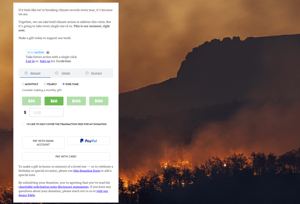
The Climate Reality Project allows donors multiple payment options, including bank account payments, PayPal, and credit cards. The organization also uses FastAction, a tool that saves donor information to autofill the donation form upon future visits.
The donation page begins with a discussion of the negative impact of climate change and a motivating sentiment about how it takes everyone’s effort to combat it. This statement demonstrates the necessity of the organization’s cause and pushes donors to contribute immediately.
The Climate Reality Project’s donation page allows donors to give a one-time, monthly, or yearly donation. When donors click to give a one-time donation, the page encourages them to “Consider making a monthly gift!” to expand their impact.
Additional Resources
For more information on fundraising with your online donation form, check out these resources:
- Fundraising Software: 15+ Leading Solutions to Consider. The right fundraising software makes it easy to design a powerful donation page that drives giving. Here are the leading solutions to explore.
- 8 Text-to-Give Platforms to Mobilize Your Donors. Text-to-give is an effective platform for sharing your donation page because so many nonprofit supporters use their phones to connect with their favorite organizations. Review top text-to-give platforms here.
- 8 Steps for How to Successfully Ask for Donations with Free Templates. Want to make your donation requests more successful? Use these free tips and templates to create requests donors won’t refuse.
You might enjoy

How to create donation forms that convert: tips and examples
Online donation forms

Top 10 nonprofit credit card processing tools for 2026
Nonprofit management