About Meredith Wanner
Meredith Wanner oversees a team of creatives as the Art Director at Achieve, where she specializes in nonprofit and eCommerce digital experiences with a focus on user strategy and engagement. Meredith has worked closely with national and regional organizations like the Boys & Girls Club, United Way, and the YMCA, as well as major brands such as New Balance, Earthbound Farms, and Ancient Harvest.
About Achieve
At Achieve, we help you investigate, activate, and motivate people for your purpose. We leverage our expertise in research, digital marketing, and web technology to understand and inspire your audience to take action.
A well-designed website is more than a pretty face. Incorporating web design best practices into your organization’s website can improve your visitors’ overall experience, their perceptions of your nonprofit (and your story), and increase conversions such as online donations.
There are entire books written on effective nonprofit website design and best practices, but to get you started we’ve listed five of our favorites below.
1. Alert Banners
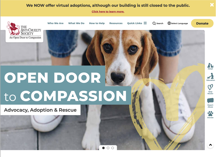
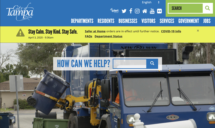
For many nonprofits, alert banners can help inform your visitors and stakeholders of emergencies or urgent information in adverse situations.
Since pop-ups might be blocked or inadvertently dismissed, alert banners are a preferred option that can be implemented to remain persistent from page to page.
A well-designed alert banner should grab your visitors’ attention without distraction.
Benefits:
- Can you hear me now? Relying on your homepage slideshows to inform your visitors of urgent information isn’t always reliable. During times of emergencies or in rural areas, low-bandwidth conditions might cause slideshows to fail to load.
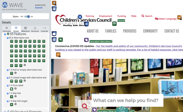
- Accessibility. When properly implemented, positioning alert banners near the top of your website prioritizes that information earlier for screen readers.
- Acting fast in an emergency. Alert banners are easily editable so updates can be made as fast as conditions might require.
Alert Banner Best Practices:
- Place it at the top. Placing your alert banner at the top of a page above the menu ensures that your visitors (and your visitors’ screen readers) are informed of urgent news first. This is especially true on mobile devices where an alert banner placed below other content might be lost below the fold and may require your visitors to scroll to see the message.
- Don’t be afraid of making it stand out. While incorporating other design elements from your website like colors and fonts might be visually appealing, a banner styled to alert your visitor to urgent information should visually differentiate it from other elements on your page.
- It’s not what you say. It’s how you say it. Even in the worst of times, or especially in the worst of times, your messaging can help your visitors feel positively towards your organization.
2. Donate Buttons
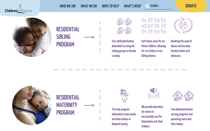
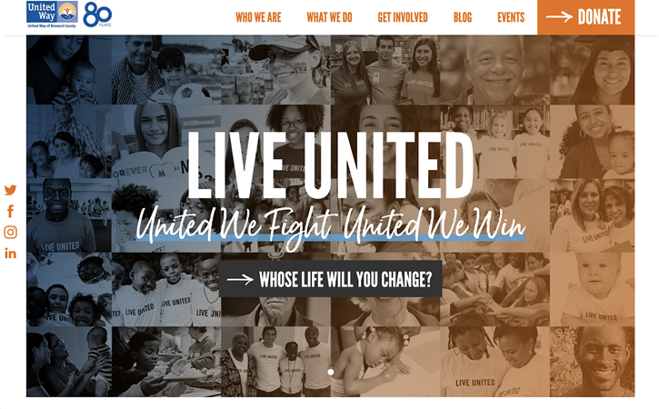
For many nonprofits, donations are their main source of funding for programs and services offered to the communities they serve. Asking for donations and converting website visitors often starts with the basic “Donate” button.
While fundraising calls-to-action can be strategically placed throughout your website, placing a “Donate” button on the top of your nonprofit website and making it “sticky” lets your donation appeal follow your visitor as they navigate throughout the site.
Benefits:
- Never lose sight of your donate button. The donation button is always visible to your website visitors as they travel through your website, regardless of how far they scrolled down a page.
- Just a click away. Website visitors can easily navigate to your donate page from anywhere on the website
Donate Button Best Practices:
- Make it pop! Visually differentiate the donate button design from the main menu navigation to grab your visitors’ attention.
- Don’t make your visitors think. Design your button to look like, well, a button. A donation button designed to look like a clickable button reduces their cognitive effort.
- Make it sticky. “Stick” your donation button to the top of the header of your home page and don’t let it out of your visitors’ sight.
- Don’t forget mobile! Chances are, many of your visitors are accessing your website from a mobile device. Make sure they don’t forget they can donate on mobile too!
3. Accessible Design
Accessible design is good design. According to the CDC, 26% of adults in the United States have some type of disability. That means 1 out of 4 of your website visitors might not have access to your website information or the ability to donate on your website if your website isn’t designed and implemented for accessibility.
Web accessibility encompasses all disabilities that affect access to the Web, including:
- Auditory
- Cognitive
- Neurological
- Physical
- Speech
- Visual
Creating and properly implementing an accessible and inclusive website is essential to provide equal access and opportunity for all your visitors. Following WCAG 2.1 (Web Content Accessibility Guidelines) ensures ALL your visitors can access the content on your website.
Accessible web design can also improve the user experience for your visitors. For example:
- People using mobile phones, smart watches, smart TVs, and other devices with small screens, different input modes, etc.
- Older people with changing abilities due to aging.
- People with “temporary disabilities” such as a broken arm or lost glasses.
- People with “situational limitations” such as in bright sunlight or in an environment where they cannot listen to audio.
- People using a slow internet connection or who have limited bandwidth.
Benefits:
- Three out of four isn’t good enough. If 1 out of 4 adults have some kind of disability, that’s potentially 25% of your visitors who might have difficulty accessing your website’s content.
- Make it easy to donate. Ensuring your nonprofit website is accessible and inclusive for all your visitors is not only the right thing to do ethically, it also can increase your web-based donations. Potential donors who are unable to access your website might also be unable to access your donation tools.
- Minimize Legal Risk. Website accessibility litigation is on the rise. Don’t put your nonprofit at risk.
Web Accessibility Best Practices*:
- Engage a certified web accessibility expert to audit your website and remediate if necessary. A certified web accessibility professional will start with checking for design and implementation errors such as:
- Include alt image tags.
- Ensure sufficient color contrast.
- Do not include text on images.
- And much more…
Relying on a certified web accessibility professional is key to ensuring your website meets the required standards.
*This list is meant to represent a sample of the WCAG 2.1 requirements set forth by the The World Wide Web Consortium (W3C) and is not a comprehensive guide.
4. Optimize Design for Mobile
In 2019 mobile internet usage outpaced desktop, and based on trends we’re likely to see mobile usage continue to grow. Since more and more people are using their mobile devices to access the internet, it’s becoming more and more important that your website not only functions well on mobile devices, but also looks good. In a lot of instances, function and design go hand in hand.
Benefit:
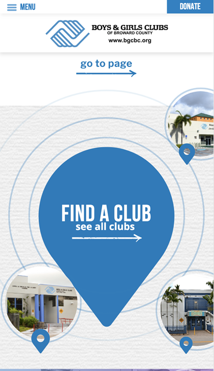
- Tucking the main menu into a hamburger menu reduces the size of the header and frees up screen space for other content.
- Linkable contact info lets your visitor contact you easily without leaving your website.
- Optimized images allow for faster page load.
- Reduce frustrating unintentional clicks with a larger touchable target.
Mobile Design Best Practices:
- Hamburger menus. Hide your menu items in a hamburger menu to reduce the height of your mobile header (high-value content like donation buttons and search functionality can be positioned next to your logo outside of the hamburger menu).
- Don’t be a stranger. Link phone numbers and addresses so your visitors can contact you directly by clicking on your phone number or open maps with your address.
- Make it fast. Optimize your images for screen viewing (reduce the resolution and dimensions of your images).
- Implement a finger-friendly design. Place touchable targets like links and buttons with enough space to avoid an unintentional click. Recommended minimum target sizes range between 28 and 44 pixels.
5. Don’t Count Your Menu Items
While too many options can overwhelm a user and cause them not to read the options, too few menu items can make for vague categories and may not offer a strong information path and lack clear guidance of what the menu items contain.
A popular menu best practice belief is that 7 is the max number of menu items a navigational system should contain. This belief is based on a 1956 classic study by George Miller called “The Magical 7, Plus or Minus 2” which found that humans on average can only retain about 5-9 items in their short-term memory. However, menus are persistent and do not require the user to memorize them.
Benefits:
- Well recognized label naming conventions help your visitor navigate throughout your website.
- Organized menu layout helps your visitor understand what your website and organization offers.
Menu Best Practices:
- List high-level categories. Your website visitors will use your menu items to get a sense of what your website and organization offer before they begin to scroll.
- Don’t get creative. Create meaningful, common menu labels that your visitors will recognize.
- Organize your menu. Prioritize your most popular or common items at the beginning and end of a menu. Organize your content in logical buckets and name those clearly. That will “advertise” what you offer on your site.
Since nonprofit website best practices and standards continue to evolve, it’s important that your website design and implementation does too. Keeping your website current helps support your organization’s efforts by better informing your community of who you are and what you do.
An easily navigable website with compelling storytelling content and well-designed calls to action can improve conversions, and the community’s perception of your organization.
Final Thoughts
Does your nonprofit website need some love? Check out this free on-demand webinar to learn simple tips and tricks to improve your website design for better engagement and donation conversion (no fancy designer tools required – we promise)!

