Share this article
Last week, we gave you some web design best practices for making your nonprofit’s website a powerful fundraising tool. This week, we wanted to show you some websites that are using some of those same elements or techniques.
Check out these examples of awesome nonprofit websites!
1. Nourishing Hope
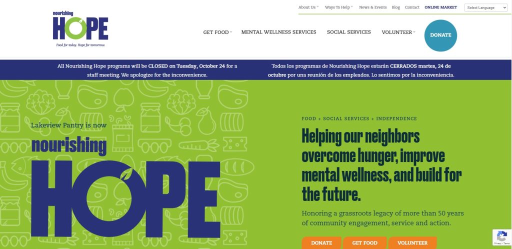
The Nourishing Hope (formerly Lakeview Pantry) website is an excellent example of a clean, organized, and well-branded website.
They make their mission clear, share recent stats, and reinforce their message with high quality photos and videos.
They’ve even used custom CSS coding to make the buttons on their donation form match the unique, stylized buttons they use throughout their website.
2. VISTE: Volunteers in Service to the Elderly
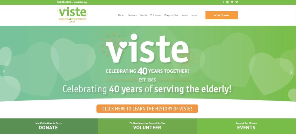
This page has a few elements that are really handy for its visitors. Aside from the fact that the “Donate” button stands out from the rest of the page, the photos that they included feature the actual people that benefit from their services.
3. CityTeam
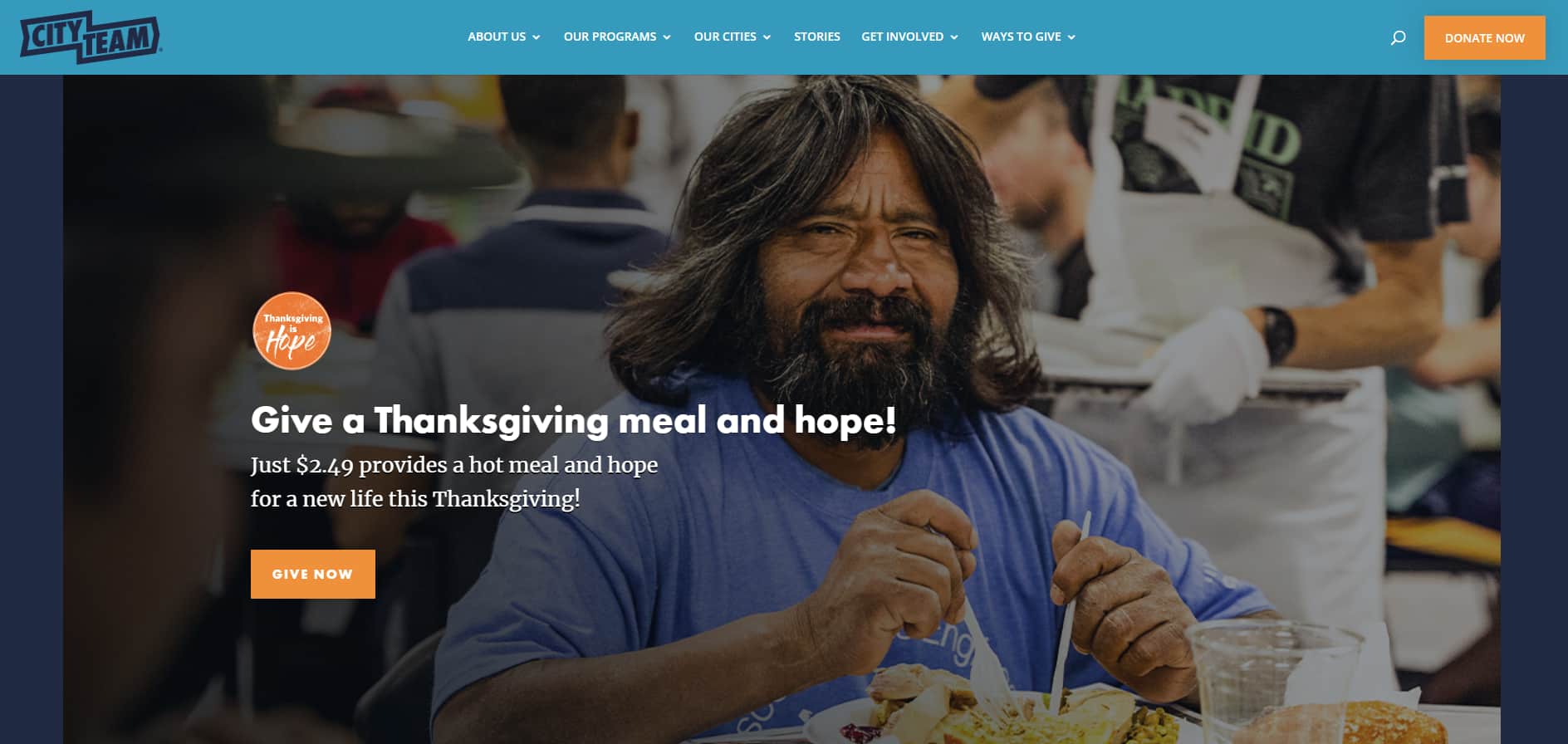
The people at CityTeam have a ton of navigation options for visitors to their sites, but they still manage to make it easy to navigate. Even with 14 different buttons at the top of the page, visitors can find the “Donate” button without a problem.
They also put a creative spin on one of the pictures featured in their slideshow—it’s eye-catching and timely.
4. Pittsburgh Glass Center
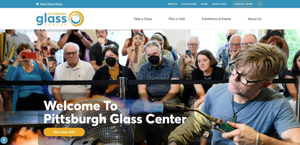
Pittsburgh Glass Center uses a video header to draw visitors’ attention and show how their art is made.
Their donate button is large and colorful and moves with the visitor as they scroll up and down the page.
A moving sidebar on the page offers links to class signups, their account, and other relevant links.
5. Goodwill South Florida
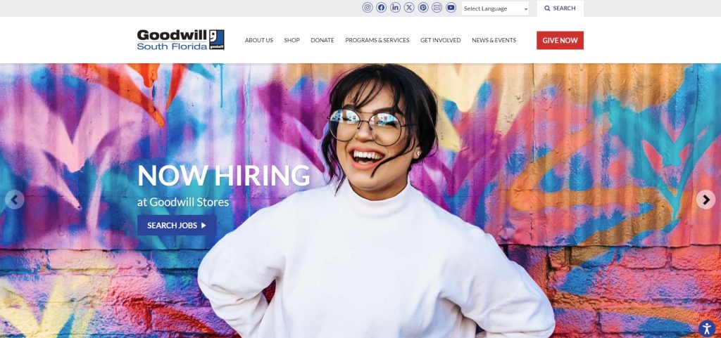
This website does an excellent job of using high quality images in a rotating header to draw the eye to important messages.
Their page is branded in the organization’s colors except for the red Give Now button at the top of the page, which stands out and becomes more noticeable.
Just beneath the header are four icons that direct visitors to commonly visited areas of the website.
Final thoughts
Need more inspiration? Check out this resource for more amazing nonprofit website tips!
Or, if you’re ready to get started designing (or redesigning) your nonprofit’s website, check out the top nonprofit web design companies.
Our partner, Achieve Agency, designed the websites for Pittsburgh Glass Center and Goodwill South Florida.

You might enjoy

Peer-to-Peer Fundraising: FAQs and Steps to Launch Campaigns
Fundraising by type

7 donation request email examples + tips to increase revenue
Fundraising ideas