Share this article
Your donation form is a key part of your organization’s fundraising success. A poor online donation form is a major hindrance to your fundraising efforts! A great form can elevate your fundraising and take it to another level. Use these best practices to make your form a fundraising powerhouse!
Make sure your form is mobile optimized
As a Millennial, I use my smartphone for everything. It’s my portable internet browser, digital personal assistant, GPS, and yes, my primary way to make online donations. I’m not alone in this ! In fact, a January 2019 article by CNBC reporter Lucy Handley shared findings of a study by the World Advertising Research Center which stated almost 75% of internet users will access the web solely by smartphone by 2025.
With mobile browsing becoming one of the most popular ways to access websites, including your organization’s site, your online donation form must be mobile optimized to provide a great experience for your donors. When your supporters land on your donation form from on their phone’s web browser, does your form resize to fit their screen? Can they use all the form’s features?
If you’ve ever browsed a website that wasn’t mobile friendly on a mobile web browser, you’re familiar with how frustrating the experience can be. A form that isn’t mobile optimized will require lots of scrolling and zooming in and out. This kind of headache can actually cause would-be donors to abandon the process! To prevent that, work with your web design team to make sure both your website and online donation form look great on mobile.
Keep it simple
Have you ever landed on a page that used a ton of photos, included an auto-playing video, or played music? How about a website that was way too text-heavy? You probably didn’t think those pages were very effective, right? At worst, they probably were even a bit distracting. Your online donation form shouldn’t overwhelm or distract your donors, either. Instead, provide a streamlined and efficient experience. That doesn’t mean take all visual and storytelling elements away. Just learn to use those elements responsibly!
Nothing is more frustrating than a slowly-loading webpage. Remember the dial-up days? Who wants to relive that experience? Overloading your webpage with videos and pictures is a surefire way to make your page load slowly. When mocking up your online donation form, take stock of how long it takes for the page to fully load. If it takes more than a couple seconds, it’s too slow.
Your webpage loads each element individually. This means that each picture, video, gif, etc. must download before your page is fully displayed. If you’ve overloaded your form with large image files or a huge video set to play automatically when the page is loaded, chances are it’ll take a long time to load the whole page – even with a decent internet connection! Keep it simple. Compress your image files and choose only one or two of the best photos for your page. Never set a video or song to auto play when you land on a page as this can be distracting and drive up page load times.
You should also keep the page simple by avoiding huge blocks of text. Chances are your supporters will either skip the text entirely or give up part of the way through. Storytelling is important, but so is brevity. You don’t need to write at length to make your case.
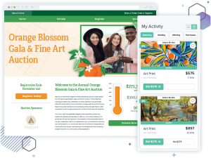
For example, take a look at this short form story on Catholic Charities of Central Colorado’s donation form:
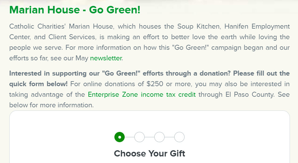
Just tell the story in as few words as possible. When in doubt, incorporate visual storytelling to help aid the telling of your story. After all, a picture is worth 1,000 words.
Ensure your donation form is secure
Open your online donation form. Then, look at your form’s URL. Does it start with https://? If you’re not an internet aficionado, those letters may not mean much to you. But I’ve been in enough internet security trainings to know that the “s” signifies you’re viewing a secure web page. Https:// links are accompanied by a padlock symbol to the left of the URL. This indicates your page is secure. Your donors want to know it’s safe to give online using your form. A great first step is making sure your donation form link is secure.
You can reinforce the safety of your online giving form by including the logo of the company that secures the form. Qgiv users have probably noticed the Digicert logo at the bottom of their forms. This is an indicator that the form is protected and that personal and financial information entered on the form is collected safely. Taking steps like this helps put would-be donors at ease and reassures them about making their gift online.
Match your form branding with your organization’s
When designing your online donation form, pay attention to its appearance. A form that looks nothing like the branding for your organization, campaign, or event could turn donors away. I’ve been confused by pages that seem to break from a company’s established brand identity before. I had to double check to make sure I was still on the company’s website! Having a webpage that breaks from your branding can confuse donors and cause them to abandon the donation process.
Here’s a good example from Art & Creativity for Healing Inc. Not only is their organization name on their donation form, they’ve even incorporated their brand colors in their text and in the artistic background applied to their form!
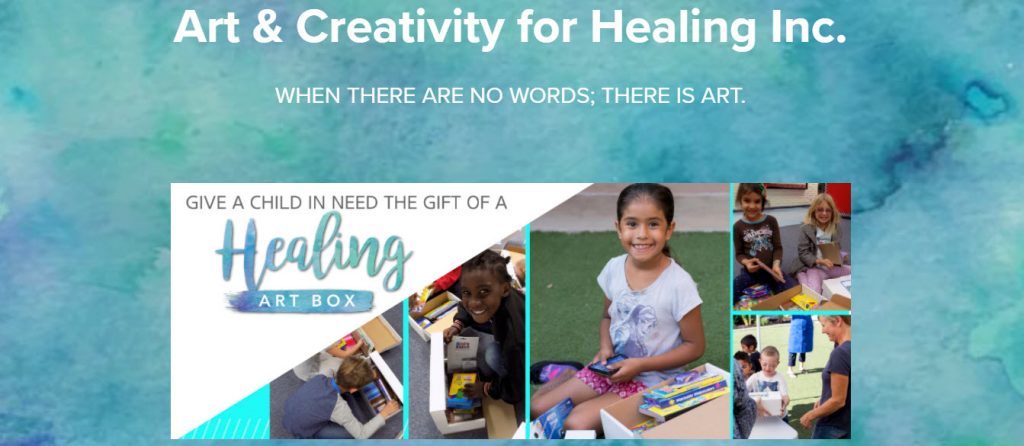
Be sure to incorporate your logo on your online donation form. This keeps donors from thinking they’ve somehow navigated from your site to a third party’s website. In the case of Art & Creativity for Healing, they moved their logo to the bottom of their donation form and relied on their brand colors and campaign images to assure donors they were in the right place.
You can further reinforce your branding by using your brand colors on your online donation form. You can also vary your branding if you have a well-known campaign or event brand that’s different than your organization’s overall brand.
If your annual campaign or event has an iconic look that embraces its own unique branding elements, be sure to match the donation form with its corresponding branding. Your year-round giving form should always reflect your organization’s current branding.
Show and tell donors why they should give
The best online donation forms don’t just ask you to give, they tell you a story about why they need you to give. How can you tell a great story without overwhelming your would-be donors with a ton of text before getting to your donation form? Your best bet is to combine visual and traditional storytelling. Write the story out in as few words as possible. Then, reinforce the story with relevant images.
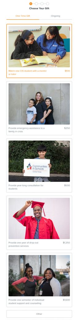
Communities in Schools of Central Texas does this masterfully, pairing images of those they serve with what is accomplished at each giving level. These impact statements with images of real people can inspire donors to give more.
You need a combination of both showing and telling. If you share your stories in a longer format on your blog, add a link to its corresponding donation form. Include lines from the story and one or two images from the post on the donation form.
Make your donation form highly visible
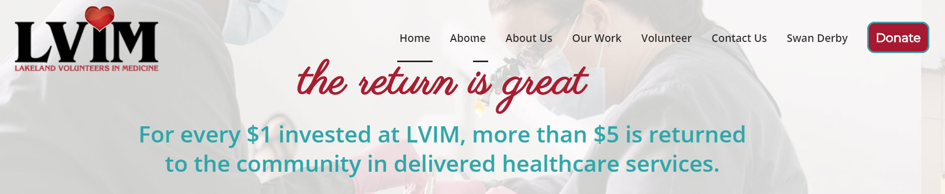
You can have the best online donation form ever, but no one can use it if they don’t visit it. Make sure your online donation form is highly visible. Add a large “Donate” button that links to your donation form on the header of your website. Share links to your donation form on social media. You can even pin a post with a link to your donation form as the top post on your organization’s Facebook page! Here are a couple great examples. The first is from Lakeland Volunteers in Medicine.
The second comes from The Sharing Center.
Getting the word out about your donation form is key to getting people to visit and give using your form. Don’t make your donors hunt for a way to support your organization. Instead, make it easy for them to find their form, make a gift, then share your form on social media. Chances are your donors are more than willing to share your campaign with their friends and family. Ask them to share the link to your form when they land on your donation confirmation page.
Incorporate a matching gifts tool
Want your donations to go even further? If you’ve got an account with a matching gift service provider, ask if you can embed a matching gifts search on your online donation form.
For instance, Qgiv users with a Double the Donation or HEPdata account can set up an integration with either matching gift service. Then, donors can search for their employer and apply for the matching gift during the donation process!
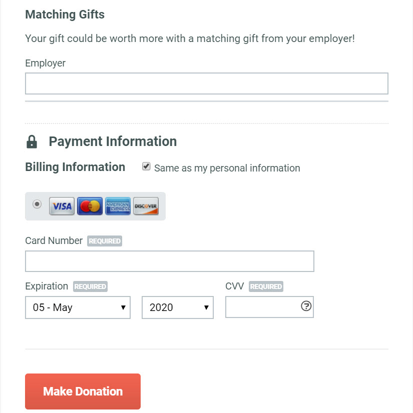
At the very least, encourage your donors to seek matching gifts from their employers. Add a line of text to your donation form asking your supporters to inquire about matching gift opportunities. If your donation form is customizable, add a checkbox so donors can tell you they’re seeking a matching gift. You’ll then know to expect the match and can follow up with the donor to get the details.
Build an awesome confirmation page
Your confirmation page doesn’t just have to be a transactional message confirming a donation was received. Instead, use it to celebrate your donors, provide them other ways to get involved (ask them to share the campaign on social media, volunteer, or visit your blog to learn more). Let donors know you got their donation, but emphasize making them feel great about their donation. A great confirmation page can help accomplish both these goals!
If your donation form is customizable, embed a short thank-you video (but don’t set it to play automatically) or image on the confirmation page. Below the donation details, include links to your social media accounts. Add a call to action for donors to get more involved with your organization. This call to action is a great place to link to a volunteer sign up form. You could also provide the shareable link to your campaign donation form, or link to the blog for donors to learn more.
Conclusion
Your online donation form is an invitation for donors to support your organization. Put your best foot forward by ensuring your donation form adheres to these best practices. Having a great donation form means it loads quickly, is easy to find and navigate, is secure, and leaves your donors feeling rewarded after making a gift.