Share this article
Rachel Clemens is the nonprofit website whisperer. She’s the Chief Marketing Officer at Mighty Citizen, a company that focuses on branding and marketing for nonprofit organizations. Rachel recently presented a webinar with us, which she called “Anatomy of a Nonprofit Website: Why Your Donors Aren’t Giving (More) Online.”
Here are 8 top takeaways from her session!
Give your website a primary goal
Choose one primary goal for your website. One! If you could ask people who land on your website to do one thing for you, what would it be? Would you ask them to donate? Volunteer? Buy a membership? Make that one goal the focus for your home page.
Why choose only one primary goal? Well, including multiple calls to action dilutes each of them. Having one primary focus ensures your message is strong and compelling.
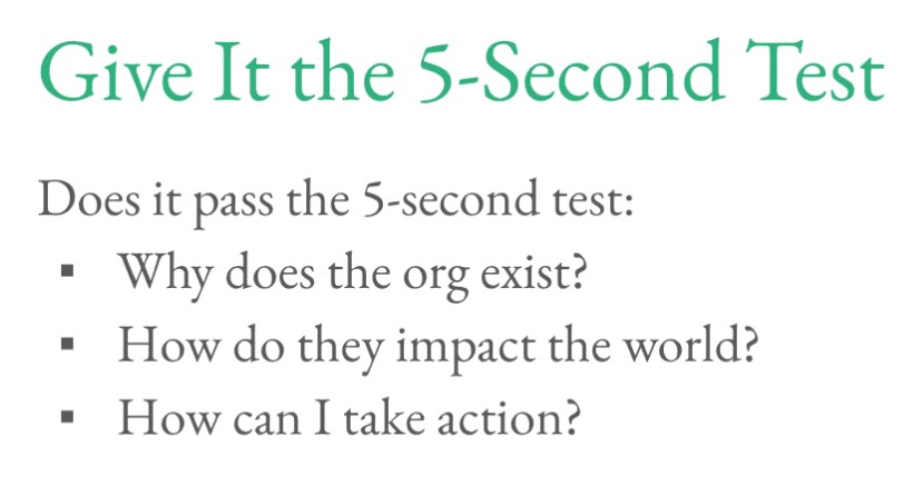
Try the 5-second test
How do you know if your homepage effectively communicates your mission and primary goal? Try the 5-second test!
To conduct this test, recruit someone who doesn’t work for your organization to look at your home page. Give them 5 seconds—no more! If they can’t tell you what your organization does and how they can get involved at the 5-second mark, it’s time to go back and work toward making your mission and calls to action clearer.
Use donor personas to build an appealing website
Not sure what content to include on your website? The first step toward writing great copy is establishing some donor personas. Donor personas are profiles you build that represent large groups of your donors. Thinking about how to appeal to a sea of faceless people is intimidating. Thinking about how to appeal to Donna, your 45-year-old mother of two who loves your children’s programming, is much easier.
Are you looking for a place to start? Check out our donor persona development checklist!
Understand your user’s journey
How do your supporters move from being potential donors to highly engaged donors? Understanding that process will help you build a great user journey for them. According to Rachel, your donors’ user journey probably looks like this:
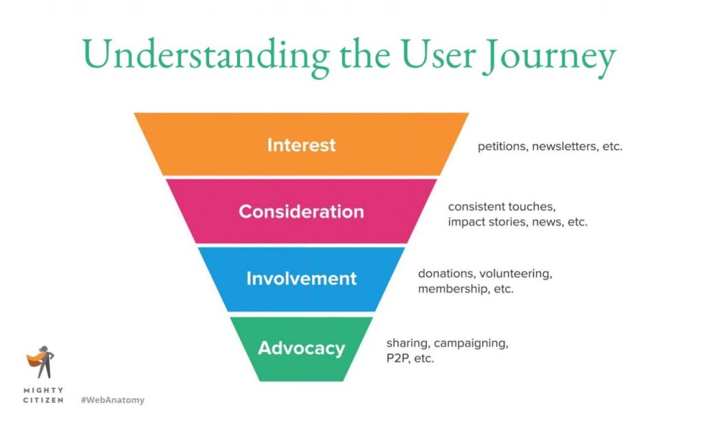
When you have a good grasp on how your donors learn about your organization and begin supporting you, you can make sure all your campaigns contain each important step.
Mobile-friendly is a must
Most of the traffic to your website comes from people on their smart phones. This is especially true if you’re pointing people to your site from channels like Facebook or email!
Imagine you just shared an inspiring Facebook post about how your donors can meet a big need. Someone read that post while they were browsing Facebook on their phone, and they tapped the link to donate. Suddenly, they went from being on a mobile-friendly app to an awkward donation form where they have to pinch and zoom and scroll to make a gift.
Don’t let that happen! Always make sure your donation form is mobile-friendly. If you’re using a Qgiv form, your donation form is already optimized for mobile devices. If you want to be extra-sure it’s as mobile-friendly as possible, take a look at this article about designing forms for mobile devices.
Put your story first
What makes donors connect emotionally (and stay emotionally connected) with your mission? Well, much of that process is driven by oxytocin, a hormone sometimes called the “love hormone.” It’s responsible for helping us form emotional bonds to people!
The easiest way to connect your donors and your mission is by telling stories about the people your donors will help. When we read stories about people, our brains produce oxytocin and we feel an emotional bond to the person in the stories.
Raise more money by placing people-centric stories front and center on your nonprofit’s website. You’ll inspire oxytocin release in your audience, which will help them bond with your clients and inspire them to give.
Craft a great hero message
A hero message is a statement that appears in a prominent place on your homepage. It’s usually displayed along with a large main image (the hero image) and is a distillation of your organization’s messaging and purpose.
A good hero message:
- Captures what your organization does—your “why”—and helps readers understand what they can achieve when they support your work
- Stays in line with your website’s primary goal
- Is simple, clear, and concrete
- Is not too flowery
Your hero message is one of the first things your donors will see when they land on your site. Make it count!
Put your contact information in your footer
This is a simple, practical tip that can have a big impact on how user-friendly your site is. When people want to contact your organization, make it easy for them to find your phone number, address, contact email, and social media channels. Your footer is one of the very first places people look for that information! Make it easy for people to find the information they want by putting it where they’re going to look for it.
Conclusion
Rachel’s webinar is full of practical, tactical web design tips that will make your website a more effective fundraising tool. If you can, watch the whole webinar! These 8 top tips are just a handful of the outstanding insights and strategies she included in her session.
You might enjoy

Donor segmentation: how to power stronger communications
Donor acquisition and retention

Raise more in 2025: Nonprofit fundraising trends, tips, and tools
Donor acquisition and retention