Share this article
Thanks to feedback from our nonprofit clients, our donation forms got a major makeover! The forms officially launched on October 26th. Several organizations have already made the switch to the new version. Check out these amazing donation form transformations! We’ve included Before and After images so you can see the original form and learn what’s changed with the form redesign.
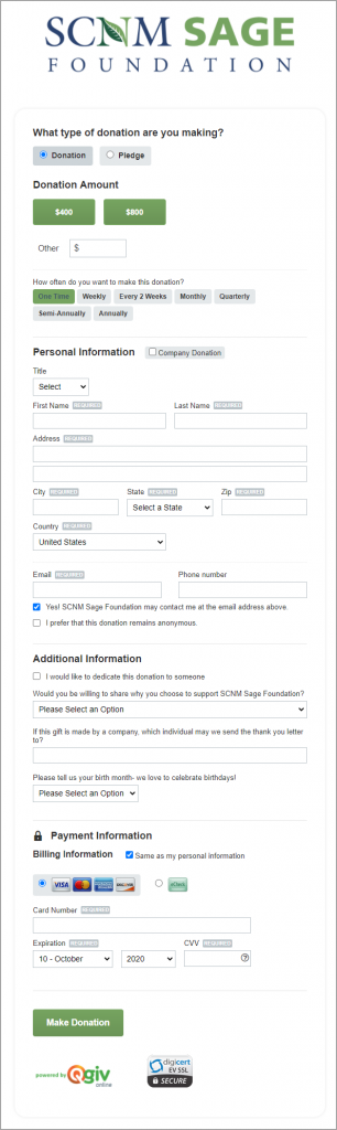
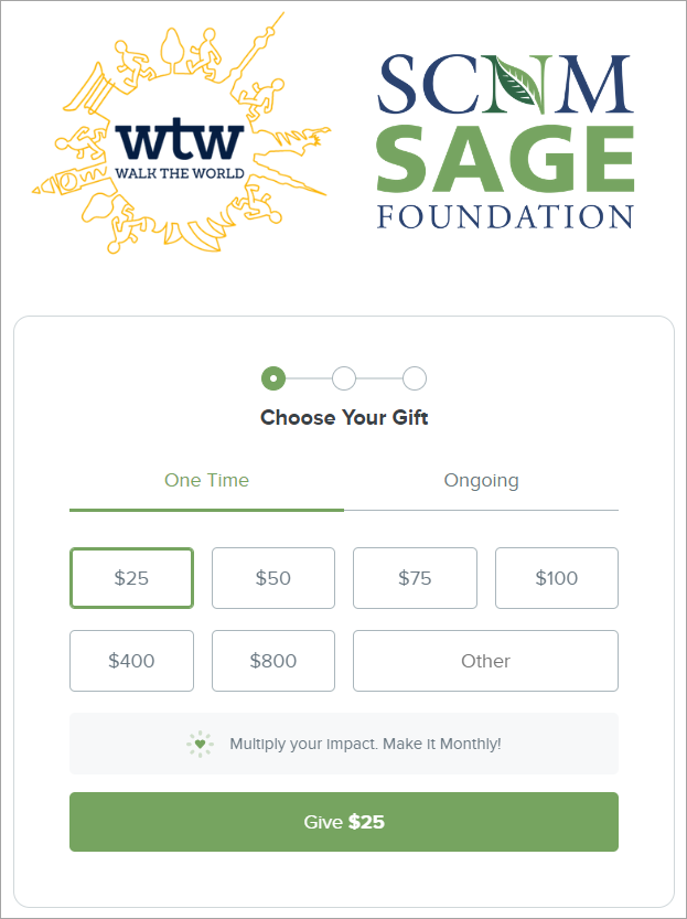
SCNM Sage Foundation’s form makeover
Before
After
What changed
SCNM Sage Foundation switched to new forms to take advantage of the multistep form option. Instead of embedding a long form on their website, they’re using a form that breaks up the process of donating into three digestible steps.
The first step is choosing their donation amount. For one-time donors, SCNM Sage Foundation also included a recurring upgrade nudge to inspire donors to make their gift monthly. This passive request has the potential to convert many one-time donors to recurring donors, which increases their lifetime value ten times!
After donors select their gift amount and decide if they want to make a one-time or recurring gift, they proceed to the next step where they enter their address information. After the donor details step, donors enter their payment information and complete their gift.
The content of their donation form didn’t drastically change. Instead, what evolved was the format. Rather than presenting their donors with a long form full of fields, the three-step process makes it easier for donors to maintain their focus while completing each section.
As you can see from comparing the before and after images, the multistep form is still customizable. SCNM Sage Foundation was able to incorporate their logo into the top content of the form to assure donors they’ve come to the right place. They took their customization a step further by incorporating their brand colors into the form. Notice how the green Give $25 button closely resembles the shade of green in their logo. In our biased opinion, we think their new form looks great!
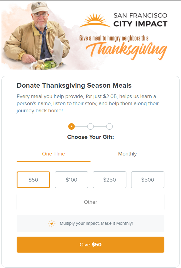
San Francisco City Impact’s form makeover
Before
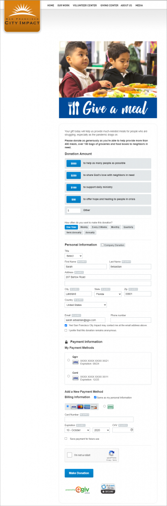
After
What changed
San Francisco City Impact is another example of an organization that switched to the multistep option. Like SCNM Sage Foundation, they opted for a shorter-looking donation form that breaks down the donation process into three easy steps.
Their form transformation added a new header that spans the width of the donation form. Additionally, they added text above the Choose Your Gift field to explain why they were raising funds and what donations accomplish.
This current form is going to be used around Thanksgiving and has been branded with that specific campaign in mind. The colors of this unique campaign have been incorporated into the form to tie all the content together. Like SCNM Sage Foundation, San Francisco City Impact incorporated the goldenrod color from their logo into their form.
The new multistep version of Qgiv’s donation forms made it possible for San Francisco City Impact to include the same custom content on their new form that they had on the old form. The difference between the two forms is that despite keeping all the custom content, their form appears much simpler and shorter.
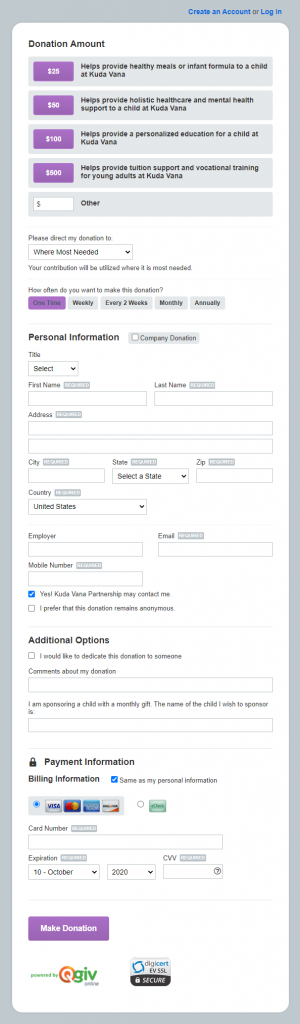
Kuda Vana Partnership’s form makeover
Before
After
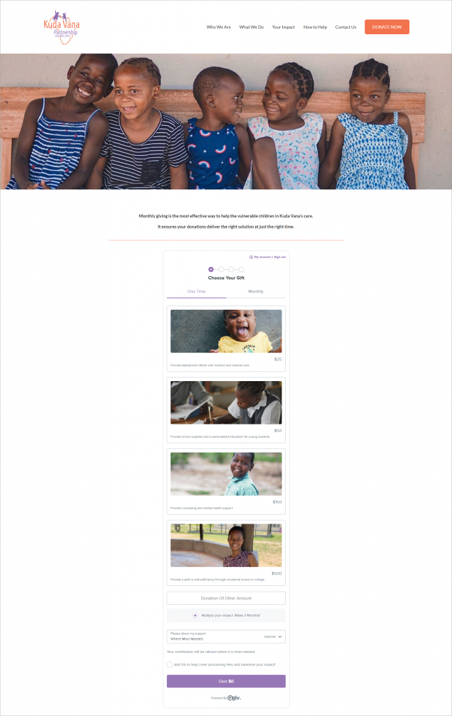
What changed
Kuda Vana Partnership’s form upgrade is a visual masterpiece. Their original donation form couldn’t include pictures of those they serve. Their new form incorporates different pictures for each donation amount to show who donors help when they give.
Adding this visual interest and putting a face to those served by Kuda Vana inspires more gifts. They didn’t just add pictures to their donation amount buttons– they added descriptions of what each donation amount makes possible. This is an element that was carried over from their previous form. Adding a value statement at each giving level shows donors what they make possible with their gifts to your nonprofit. This concept is one Kuda Vana Partnership wholeheartedly embraces. Pairing that value statement with a picture of a child they care for shows donors their gifts are used well.
Like the other two nonprofits we’ve highlighted in this blog post, Kuda Vana chose the multistep form to break the donation process down into three easy steps. Kuda Vana Partnership’s logo doesn’t appear on their form but appears on their website. The header of their site shows donors they’re in the right place without having to show the logo on their form. They’ve incorporated the purple from their logo into their donation form to tie it in to their website.
Is there a single-step option with these upgrades?
Yes! While the nonprofits in these examples opted for the multistep donation form, many nonprofits have chosen to create new single-step forms. Qgiv’s new single-step donation forms still include the recurring upgrade prompts, donation amount image support, conditional fields, customization options, and more great features that enhance the experience of your donors and raise more money for your mission.
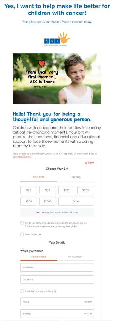
ASK Childhood Cancer Foundation’s single-step form makeover
ASK Childhood Cancer Foundation uses a single-step version of Qgiv’s new donation forms to capture donor information in a single step. They added a lot of custom content to the top header and played with the button colors on their form. Check out their use of a playful font in the custom content above the donation form fields, too! Their form looks playful and friendly, which inspires supporters to give.
Click through to see their full form!
Conclusion
Thanks to feedback from fundraisers, Qgiv added elements to standard donation forms designed to increase donation conversion. With these new features came a clean, modern look that’s easy to incorporate on any website.
Upgrading to new forms is optional for nonprofits. However, these four organizations jumped at the chance to give their existing donation forms a serious makeover. From increased options for customization, the choice of a multistep or single step donation process, and the ability to add images to donation amount buttons, these four nonprofits have made their donation forms work better for their specific fundraising needs. Want to learn more about Qgiv’s online donation forms? Visit our product page or request a demo to see our donation forms in action.