Share this article
“Ethical design” is a new buzzword that emphasizes user-friendliness for people of all ages, backgrounds, and abilities.
We love it when a nonprofit has a strong brand! Part of the reason Qgiv was founded was the emphasis on building donation forms that matched a nonprofit’s brand. But that brand mustn’t be so limited that it makes the donation process difficult.
Donation forms should be well-branded, but they should also be accessible to people like Mature donors and older Baby Boomers, who account for almost 70% of charitable donations, to people with sight or hearing challenges, and a broad range of other donors.
There are tons of resources that will help you appeal to different generations and abilities, build fundraisers they’ll appreciate, and keep them invested in your mission. But one often-overlooked element is the actual giving process itself. Is your donation process user-friendly for donors of all ages?
Here are some elements to double-check before your next campaign appeal.
Is your remittance slip easy to fill out and mail?
Think about your donors who loyally give by mail. If you’re like most nonprofits, those donors are generally older — statistically, they’re probably part of the Mature generation.
If you want to capture those donors, make it as easy as possible to fill out the remittance slip and mail it back to you. You can help make this process as easy as possible by:
Using a remittance page, not just a slip
Have you ever tried to fit an entire phone number on a 1-inch line on a remittance slip? Have you ever tried to write your email address on one? I’ve got good handwriting, and I can’t pull it off. Asking someone who is older and may deal with poor eyesight or shaky hands to do so is impractical. Instead, use a full-page remittance slip and give donors plenty of room for their personal information. It’s better for your older donors in particular, but anyone who decides to donate via direct mail will appreciate it.
Including a self-addressed, pre-paid envelope
Full disclosure: I have my late grandmother in mind here. She had very shaky hands, and addressing an envelope took a lot of time and effort on her part. It took even more time and effort for her to get up, move across the house, and find a stamp. She was a loyal supporter of several organizations, and she would have appreciated self-addressed, pre-paid envelopes with which to return her donations. Offer that convenience to your older donors! This is another step that is good for seniors but will also be appreciated by all your donors. People are much more likely to give if it’s easy for them!
Working on making your donation process senior-friendly is important, especially for direct mail. Donors who give via direct mail are generally older donors, and they’ll certainly appreciate the thought you put into it.
Is your donate button easy to find?
People have short attention spans, and they will generally spend 3-5 seconds on your website looking for the link or information they seek. So, if someone lands on your website looking to donate, they will spend about that long trying to find your donation form. If they don’t find it quickly, the odds of their making a donation drop precipitously.
This is true of senior donors, too. It’s best practice to make your “Donate” button easy to find by making it a contrasting color and placing it somewhere easy to locate. This is especially helpful when senior donors are navigating your website, particularly if they have poor eyesight or other accessibility issues. It’s also a good move in general, as it makes your donation form easy to locate for users of all ages and abilities.
You can apply the same concept to links in newsletters or email appeals. Use large, bright “Donate Now” buttons in your emails — they’re easier to locate (and easier to click) than text hyperlinks.
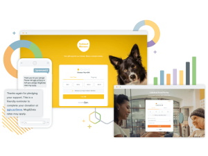
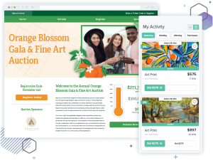
Is your online donation form user-friendly?
Take a look at your online donation form. Is it user-friendly for people of all ages and abilities? Here are some elements that will make it easier for everyone to use:
- A font that is easy to read, both in style and in color
- Text that is not overly small or cramped
- Reasonably-sized fields
- Few (or better yet, no) extra fields
- No CAPTCHA, or, if there is one, a simple one
Making these changes is a small task, but it can make a big impact! Simple changes, like turning small, grey font into larger, black font and eliminating some required fields makes donating much easier. Field labels are easier to read, donors have fewer questions to answer, and the process takes less time. It’s an improvement for everyone!
Conclusion
When you’re a fundraiser putting together a donation form or appeal, it’s hard to find time to stop and imagine how different donors will interact with you. But anticipating and mitigating issues that may trip them up — issues like small font size, dinky remittance slips, or frustrating CAPTCHAS — will make a big impact. The easiest way to lose a donation is making it too difficult to give; earn more by making the process quick and easy for everyone!

You might enjoy
30 most effective nonprofit software solutions for 2026
Nonprofit management

15 sponsorship letter templates to spark new partnerships
Donor acquisition and retention