Share this article
The Qgiv team has been working hard on some serious upgrades to our donation forms! I sat down with Cristina Ordaz, Senior UI/UX Designer at Qgiv, to learn about the research that went into the updates. Read on to discover what Cristina discovered about donor preferences, the psychology of giving online, and a few best practices that surprised our team. First, a little about Cristina:

Cristina Ordaz is a Senior UI/UX Designer at Qgiv. She’s a member of the Fundraising Team and works to enhance the fundraising and donor experience across Qgiv products, challenging assumptions and championing users every step of the way.
Her career has spanned a variety of design roles with a growing focus in user research and product design. She brings an extensive background in usability and visual design to her current role, and never gets tired of creating interfaces that are beautiful and easy to use.
Cristina also enjoys reading, table-top gaming, and talking about her cats. Yes, she will judge a book by its cover.
First, what kind of research went into designing the new forms?
Christina used three different phases of research to jumpstart the new forms’ design. First, she did more “academic” research—she attended lots of webinars and read research from other companies that work closely with nonprofits to market their missions and encourage donations.
Then, Christina conducted interviews with 5 different donors. She focused on their mindsets and preferences while they donated, but she also worked hard to understand their mindsets throughout the donation processes. “I really wanted this to be an opportunity to build empathy with them,” she said, and explained that being able to understand donors’ thought processes is an important part of the design process.
Lastly, Cristina and her team conducted user testing with 10 different donors of all ages, genders, and backgrounds. Each donor received a credit card and a scenario to guide them through making a donation. 5 of them were on desktop computers and five were on mobile devices. Cristina didn’t guide them through the donation process—she just observed them as they interacted with Qgiv forms. The notes she took about their reactions, preferences, and sticking points played heavily into the final design.
What did we discover about donors’ pain points while they give online?
Donors had some similar feedback about the forms they used to give online. They found the forms “long and busy,” even when the number of fields on the forms were kept to a minimum. “The forms asked for too much information,” Cristina explained. That feedback resulted in some small but important changes in the new forms, including updates to the list of fields that were automatically included on legacy forms. Even small changes, like not automatically including a special field for the donor’s title, can make a big difference!
Cristina explained that though much of the feedback she received during her research was expected, she learned a lot from watching donors interact with the forms. “What’s great about user testing is that you watch people struggle with the small things that you didn’t expect to be challenging. You can then make little changes that have a big impact,” she said. She noted that some of the small details donors found difficult included the date picker donors use to set start and end dates for recurring donations and the process of applying promo codes to event registrations. Donors’ reactions to everything—even choosing a date or applying a promo code to a transaction—informed the new design.
Was Cristina surprised by any donor feedback or preferences?
Cristina mentioned that she interviewed an elderly woman who had previously donated to her granddaughter’s peer-to-peer fundraising page. The donor mentioned that she actually preferred to give online, which Cristina found surprising—our Generational Giving Report found that the majority of donors in her age group prefer to give by personal check! This just goes to remind us that while we can make general conclusions about donor preferences, donors are individuals with their own unique habits! Cristina also mentioned that another donor felt safer giving online than she did when giving other ways. To her, processing a gift online felt much safer than, say, giving her credit card information to nonprofit staff over the phone or through the mail.
Cristina was also surprised by some of the things that inspired donors to give in the first place. “One girl said she was sitting on her couch working on her budget, and she realized she had a little extra room in her budget that month,” Cristina explained. “She was sitting in her living room with her dog. It was snowing, and she was thinking about how if she hadn’t adopted her dog, he could be out in the cold and the snow.” That thought inspired the donor to go online and make a gift to the local animal shelter. The donor didn’t respond directly to an appeal or a call to action—she was moved to give by her circumstances. Anything can inspire a donor to give!
When Cristina started building the new forms’ layout, she used a concept known as “chunking” to make it easier to give. But what IS chunking? And why is it important?
“’Chunking’ actually comes from psychology!” Christina explained. It’s a way to take a large thing or process and break it into smaller, more manageable “chunks.” It makes processing information easier, which reduces the mental load a person has to manage.
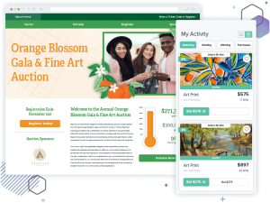
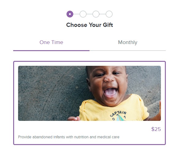
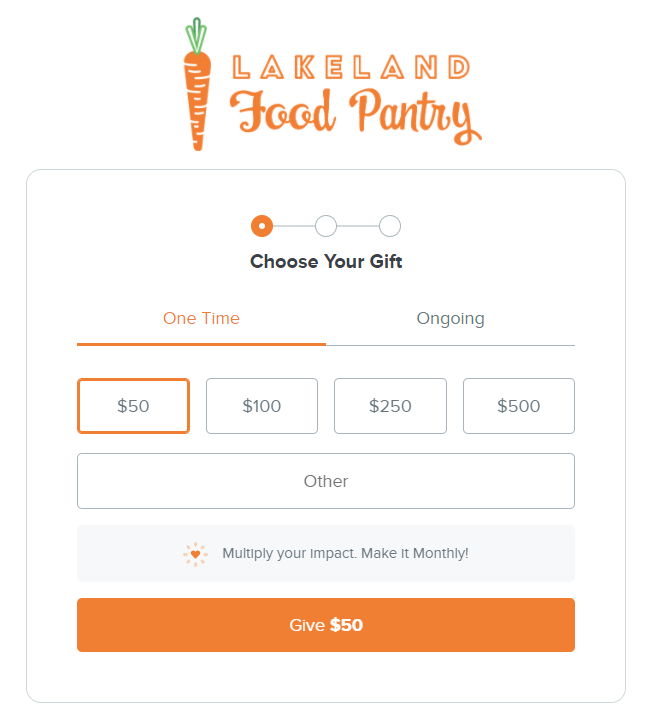
That’s why new Qgiv forms offer a multistep layout option that separates different parts of the donation process into their own “chunks.” If you have a donation form with a few custom fields on it, consider trying the multistep layout.
“This makes something feel less complicated, and sometimes that’s even more important than it actually being less complicated,” Cristina explained. When the donation process is divided into chunks, donors perceive the giving process as being less complex… even if the process is exactly the same as it was when it was all on one page.
One of the biggest goals for the form redesign is to “reduce friction” for donors. But what does that really mean?
“Friction is basically anything that keeps a donor from finishing their gift,” Cristina explained. “And there are lots of different kinds of friction!”
One of the kinds of friction tackled by the new forms is device friction. Cristina explained that the new forms were designed intentionally to make donating on any device as simple as possible. “We don’t see as much conversion on mobile, but we know the traffic is there,” she said. “There’s a lot of opportunity there.”
In 2019, half of all nonprofit website visits came from users on mobile devices (up 11% from 2018)! Between mobile + tablet, that’s almost 60% of traffic! Making the most of that opportunity was at the forefront of the form redesign, and the new forms were built specifically to capitalize on all the traffic to mobile forms with thoughtful touches like finger-friendly touch targets (i.e. look bigger and clickable area is expanded and optimized for fingers) and bigger, clearer, more legible text and headings.
Other kinds of friction, like field friction (too many fields intimidated and overwhelmed donors) and decision friction (too many options, like lots of restrictions, many different recurring options, dedication options, etc.) are also addressed in the new design. Cristina and her team used chunking and other design updates to reduce friction points and make forms less overwhelming.
We talk about using design choices to “reduce anxiety” for donors. Are donors actually anxious when they give?
“When we talk about anxiety, it’s more of a subconscious anxiety,” Cristina explains. “Donor anxiety happens when a donor has unanswered questions.” That’s why it was so important to Cristina and her team to interview donors and watch them go through the donation process! Understanding what caused donors’ subconscious anxiety helped the team make small design changes to answer their questions.
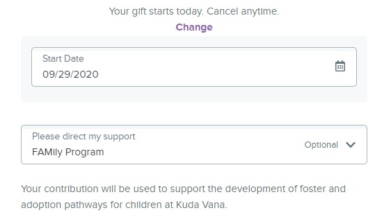
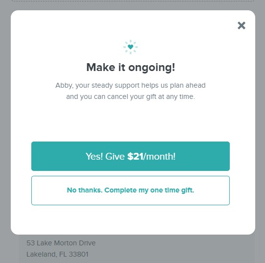
One example came up when donors made recurring gifts. “Donors wanted to know, ‘Can I cancel if I need to?’” Cristina explained, “So we added a tiny bit of text saying donors could cancel their gift any time.” She also explained that some people encountered unanswered questions when they were asked if they’d like to add a little to their gift amount to cover processing costs. “They wanted to know, ‘What does cover costs mean?’ So we added some tool tips that help explain it.” Those tool tips are a way to answer questions without adding lots of extra text to the form, which can intimidate donors.
What other changes will help answer donors’ questions?
Cristina said that another area that prompts lots of unanswered questions for donors is the personal information section. “There are lots of questions there. Why do you need my phone number? Will you call me? Is my credit card information safe?” She and her team spent a lot of time focusing on the personal and payment information sections to make donors feel safe. They also intentionally added small bits of text to the form to let donors know what to expect, like a small note that says “We use your email address to send you your receipt!”
One important change to the new form design is the widget to add a footer to the landing page. The footer is a valuable place to add trust indicators that answer donors’ subconscious questions about the organization’s legitimacy. “One big question donors have is about the organization itself. ‘Is this a legitimate organization? Will they use my money well? Can I trust them?’” Cristina said. “Adding information to your form that makes donors feel like you’re trustworthy is important. Even something as simple as adding a phone number can make a big difference.” The new footer widget is a valuable way to display your organization’s contact information, 501(c)(3) information, and other trust indicators that show donors you’re a legitimate organization.
After months of research, interviews, and development, what changes does Cristina find most exciting?
This was the hardest question for Cristina to answer! After some thought, though, she came up with two really great answers.
Cristina’s first answer boiled down to the cosmetic changes to the form style. “I like looking at pretty things,” she said, “And it’s so nice to look at! It’s like a breath of fresh air.”
The other feature Cristina’s especially excited about is the stronger defaults for new forms. “Some organizations don’t have time to sit down and build a whole new form right away,” she said. “These forms will be stronger right away.” Some of the stronger defaults she mentioned are simple, like excluding some personal fields to adapt to changing best practices. Displaying the “Title” field, for example, used to be best practice but isn’t any more. That field is now hidden by default (though you can always turn it on if you need it). Another new default is the “upgrade nudge” that asks donors to consider making a recurring gift, which is a strong way to connect with donors while they’re already feeling great about supporting your organization.
New forms are coming soon—keep an eye out for updates!
Interested in using new forms? If you’re already using Qgiv, send us an email at support@qgiv.com! We can answer your questions and talk to you about how to upgrade existing forms or build new ones.
If you’re interested in trying Qgiv, let us know so we can set up a personalized demo of our platform and a sneak peek at the upcoming form design.