Share this article
Online fundraising is the norm. But how many nonprofits are making big fundraising mistakes? Here are five things nonprofits get wrong about online donations.
1. Not being mobile-optimized
I know, I know, you’re getting tired of hearing it…but it’s THAT important. With Google’s recent changes to how mobile-optimized sites are displayed in search results on mobile devices, you could find your nonprofit’s website slipping way down the list if it’s not geared for mobile users. With almost 10% of donations coming from mobile devices in 2014, having your site and donation form optimized is a necessity, not an option.
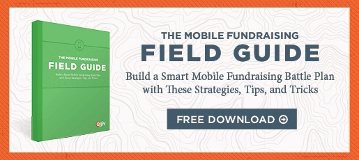
Take a look at our Guide to Mobile Giving.
2. Making it difficult to donate
If donors can’t quickly and easily find your donation button, they’re going to leave your page. You can make donating a less frustrating process by having a large, brightly colored donation button in an easy-to-find location. Oh, and don’t make potential donors scroll to find it!
3. Making donating a time-consuming process
Donors want to know their time is valued. You can show this by not asking for too much information right off the bat. Collect the basics, like name, address, and payment information. Don’t irritate your donors by adding unnecessary steps; no one wants to spend time choosing from a complicated list of restrictions or having to answer multiple questions before making a donation.
4. Not branding the donation page
Your nonprofit’s website may be beautifully designed, but what happens when donors click on the “Donate Now” button and are taken to a donation form that looks like a completely different site? Having seamless design makes donors feel more secure about giving their billing information – they don’t feel like they’ve left your site and gone somewhere untrustworthy. Plus, customizing your form to match your organization’s branding can raise 6X more in donations than an unbranded form. Can’t argue with that!
5. Not putting easy tasks first
No one wants to dig out their credit card right away and fuss with holding it at just the right angle so they can see their faded CVV number. (Seriously, why don’t they make those things more durable?) Behavioral psychology research shows people are more likely to finish something once they’ve completed part of it, so putting simple tasks at the top of your form has a positive psychological effect. Let donors select their donation amount and enter their address before you ask them for payment details. Feelings of anxiety are highest when donors enter payment information, so save it for the end!
Want to learn more? Head over to our ultimate guide to donation pages!