Share this article
You spend a lot of time and energy creating great fundraising campaigns and compelling appeals. But how much time do you spend perfecting your donation form?
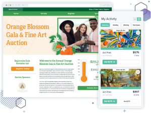
There are a few reasons to work on building the best-possible donation form. One, it’s an important fundraising asset and all of your posts, emails, and appeals will point to that page. Two, a well-optimized form will inspire people to donate, and it will inspire them to donate more! In fact, we’ve found that our clean, modern donation forms convert at twice the rate of older style donation forms… and the recurring donation conversion rates actually increased by 173%!
Why focus on great donation forms?
Believe it or not, most people who land on your donation form haven’t decided to donate. On average, 83% of potential donors who visit your form won’t give. There are a lot of reasons they don’t donate, but most of those reasons can be boiled down to three categories:
- Lack of trust (Is this form the right form? Am I donating to the right cause? Will this organization use my money well? Is this a good choice?)
- Anxiety (How much should I give? How much do others give? How will this nonprofit use my personal information? Will my credit card information stay private? What happens after I make this gift?)
- Friction (This form is hard to use! Why are there so many fields to fill out? This is overwhelming.)
Luckily, good design can minimize all of these obstacles. Here are 6 tips that will help you build a compelling and effective donation form!
1. Make it mobile
There’s no avoiding it— donors demand mobile-friendly donation forms. At this point, more than half of all Internet traffic comes from people on mobile devices, and Google prioritizes mobile-friendly websites in their search results. According to a study by our friends at NextAfter, nonprofits can increase donations by 126% (on average) just by making their site and form mobile friendly. Mobile-friendly sites get more traffic, and more traffic means more potential donors!
More and more people are using their phones to pay bills, shop online, and support nonprofits. Get in on that action by making sure your donation form looks good and is easy to use on your mobile devices.
If you’re a Qgiv client your donation form is already optimized to look great and work well on phones and tablets (though do make sure your website is equally mobile friendly). If you’re not using Qgiv and want to optimize your donation form, you have a couple of options. One, you could contact your online fundraising provider and ask about converting your form to a mobile-friendly format. Two, you could reach out to your webmaster to work on getting your site—and your form—updated. Or, three, you could talk to us at Qgiv and get a shiny new form that was built with mobile donations in mind.
2. Reiterate your story on your form
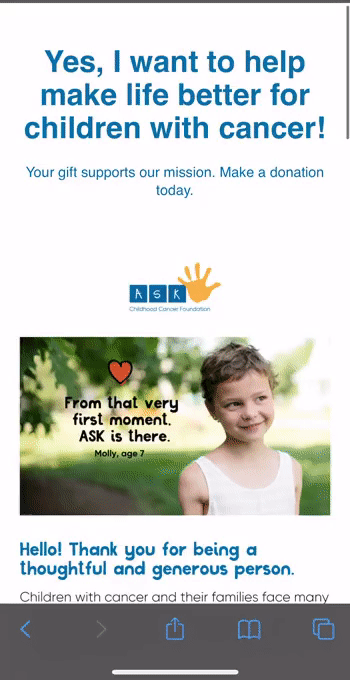
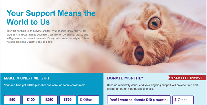
By the time donors land on your donation form, they’ve seen something about your organization that tugged on their heartstrings enough that they’re considering making a gift. Whether they came to your form through an email appeal, a story you shared on social media, or some other avenue, something you’ve shown them inspired them. Keep that feeling going by adding storytelling elements to your donation form!
Now, this doesn’t mean you have to do a ton of storytelling or design on your form. You’ve already put together an effective appeal. Here, your mission is to add a couple elements to your form that maintain the donor’s emotional connection to your work while reassuring them that they’re on the right donation form. Add a high-quality photo that’s related to the story you’ve been telling (hint: use a photo where 1-3 people are making eye contact with the camera and smiling— donors will respond well to those!). Then, write a short impact statement about what donors will accomplish when they give. That impact statement can make a big impact (get it?)—NextAfter found that adding an impact statement to a donation form can boost donations by up to 150%!
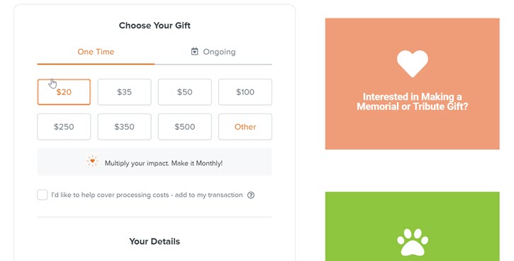
3. Be intentional with donation amounts
One way you can reduce donor anxiety is by adding suggested donation amounts to your form. Choosing from a few different donation amounts is much less stressful than picking an amount all on your own! Adding suggested donation amounts also helps raise more. If a donor lands on your page and sees a suggested donation amount of $25, they’ll often opt to give that amount even if they initially intended to give only $20.
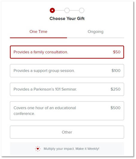
Want to raise even more? Try adding an impact statement to each of the suggested dollar amounts. In NextAfter’s study, that simple change yielded a 64%-78% increase in conversion rates.
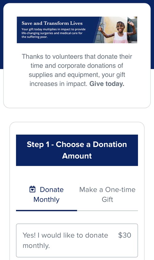
4. Offer recurring gift options
If you don’t have recurring options on your donation form, make sure you add them! Giving donors the option to support you on an ongoing basis is important. You’ll raise more money, improve your donor retention rate, and build a stream of predictable revenue. Not sure if you want to explore recurring donations? These statistics may change your mind:
- 45% of donors give to a monthly giving program
- Monthly donors give ~42% more annually than one-time donors
- 52% of Millennials prefer to give monthly over giving one large gift
When you enable recurring options for your donation form, keep these two tips in mind. First, don’t go overboard with the available billing options. Stick to the most common ones—like monthly or quarterly billing—and see how your donors react. If you get a ton of requests for some of the more unusual frequencies (like bi-weekly or bi-annually), go ahead and add them. Keeping options minimal improves conversions! Second, keep the default billing frequency set to one time. Defaulting to a recurring donation can make many people feel like you’re trying to pull a fast one by tricking them into making a long-term gift. Let the donors choose! If you want to encourage recurring donations, try a recurring nudge instead. Click here to read more about recurring nudges and how they work!
5. Reduce time spent on form
Resist the temptation to use your form as an information-gathering tool! The longer it takes for a donor to complete your form, the more likely they are to quit before they’re done. Streamlining your donation form keeps the donation process short and sweet, which increases the odds that donors finish their gifts. Go through your donation form(s) and remove any information that isn’t absolutely necessary for processing gifts. You’ll be surprised at what you can cut! Simply removing the field for a donor’s phone number—or even making that field optional instead of required—can significantly improve your conversion rates.
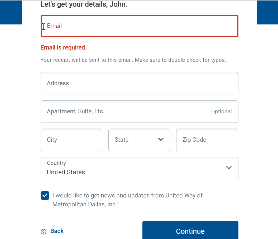
Looking for ways to gather additional information from your donors? Send them a survey after they’ve made their gift! It’s a great way to collect more information (like their phone number), learn about their communication preferences, and learn about what inspired them to give in the first place. Try sending an email to new donors to introduce yourself, thank them for their involvement, and ask them to tell you more about themselves.
6. Remove distractions
We’ve all done it. We’ve all gone online to look up a recipe or news article, then found ourselves 6 Wikipedia articles deep learning about an obscure historical figure or stuck in a YouTube wormhole (who can watch just one cat video?). Humans are notorious for having short attention spans, and they’re especially short when we’re on the Internet.
Keep your donors focused on the task at hand by removing distractions from your donation form. One simple change to make is removing all external links (including footer links!), which NextAfter found increased donations up to 195%. Another thing you can do is go through and remove conflicting calls to action. If you have anything on your donation form that asks donors to do anything other than give, remove it! That includes elements like newsletter sign-up boxes or links to blog articles. You can add those in on the confirmation page, just keep them off the donation form!
Additional Fundraising Resources
Every email appeal, social media post, and (hopefully!) direct mail piece sent will direct people to your online donation form. Make sure you’re ready! Use these 6 tips to optimize your form before the end of the year—you’ll see improved donor conversion rates and raise more money.
Looking for more year-end fundraising ideas? Check out the additional articles for more fundraising tips and strategies: