Share this article
Believe it or not, your online donation form and page can be a huge deterrent to giving. Donation forms that have too many steps or required fields, don’t look secure, aren’t mobile-friendly, or are hard to find, can deter donors from making impactful gifts.
On the other hand, an optimized donation form can even encourage gifts from those who might be on the fence about donating and bring you more revenue overall.
This guide will walk through what a donation form is, some top tips to make your online donation process efficient and intuitive, and some form examples:
What is a nonprofit donation form?
A nonprofit donation form is the list of question fields you provide on your donation page for donors to fill out and submit their donations. Your donation form has two essential roles:
- Processing online gifts
- Collecting key donor information
Core donation form fields include contact information, gift amount, and payment details. By making your form as user-friendly as possible, you can more easily gather this information, process donations, and use the data you’ve collected to strengthen donor relationships.
11 donation form best practices
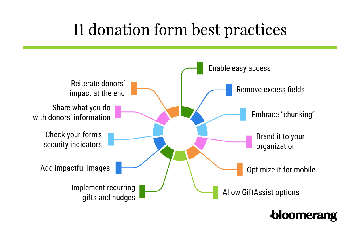
1. Enable easy access.
Donor drop-off can happen when users start filling out your form, but how many are turning away before they’ve even found it? Burying a donation form under a mountain of text or requiring users to search for the form link on your donation page can prevent donors from reaching your form in the first place.
Make your donation form easy to access by linking to it on the header of your site. Embed your form at the top of your online donation page so donors don’t have to scroll to see it.
Additionally, take it a step further by creating a clear and noticeable “Donate Now” button that donors can click on to go directly to your donation form. Make your button a color that contrasts (but complements!) the other colors in your navigation menu to make it even easier to find.
2. Remove excess fields.
If your form is too long and complicated, ask yourself whether you need all those required fields and custom questions. Chances are, you’re asking for a lot of optional information that donors don’t have time to give.
Removing additional fields from your donation form is one of the simplest ways to improve your conversion rates. Go through your form and delete any fields that are not necessary for processing a gift.
This doesn’t mean you can’t collect that information in other ways! For example, if you want to collect additional information about your supporters, try including a link to a survey on your confirmation page and in your automated receipt. Invite donors to tell you a little about themselves—they’ll have the opportunity to share more about their passions and motivations, and your donation form’s conversion rate will go up.
Alternatively, try using conditional fields. If you want to collect contact information for major donors, for example, you can create a form field that appears only if someone gives above a certain amount. Conditional fields keep your form simple and streamlined without missing out on the opportunities to collect extra information under specific circumstances.
3. Embrace “chunking.”
Chunking is the process of splitting a large process into chunks or individual steps. It can make a process feel less complicated (even if you didn’t simplify the process at all!), and it’s a powerful strategy to apply to your donation form.
When you split your form into chunks, donors aren’t intimidated by a long donation form they have to scroll through. Instead, they’ll choose their donation amount and move on to the next step in the donation process. This way, they’ve already decided to give—everything else is just a formality.
4. Brand your online donation form to your organization.
As soon as someone stumbles upon your nonprofit donation form, they should know immediately that it is for your specific organization. Branding your donation form creates a seamless online giving experience and maintains potential donors’ trust.
To brand your nonprofit donation page, make sure to:
- Use the same fonts and color scheme as the rest of your website.
- Incorporate your nonprofit’s logo.
- Display your nonprofit’s mission statement at the top.
Additionally, branding your online donation form increases brand recall in the future. When new supporters see your logo in other contexts, they can immediately connect it to your mission and cause.
5. Optimize your donation form for mobile.
In 2024, 53% of nonprofit website traffic came from mobile devices. If your donation form doesn’t display neatly on a smaller screen, it will be difficult for many donors to give.
By choosing a mobile-responsive donation form layout, you can ensure all mobile users have a seamless donation experience. Additionally, you can also do the following to boost mobile-friendliness:
- Keep your web design simple.
- Make all touch targets large enough to tap.
- Ensure text is large enough to read.
- Optimize image sizes.
Check your donation form’s mobile-friendliness using a tool like Lighthouse. That way, you can receive targeted suggestions for how to improve the mobile version of your form.
6. Implement recurring gifts and nudges.
You likely already know that recurring donors are among the most important people who drive your mission. Even if the amount they give is much smaller than your major gifts, having a consistent form of support adds up to quite a large amount and offers your nonprofit some financial stability.
Within your online donation form, there are two main ways that you can prompt recurring gifts for your donors:
- A recurring nudge. This is a note that appears on the form but doesn’t interrupt the donor’s progress.
- The recurring modal. On the other hand, a recurring modal asks donors to pause as the form poses the question of whether or not they want to make the gift recurring. This is typically a pop-up window over the donation form itself. The donor then has to either decline or accept before moving on.
The right online giving software can automatically charge your donors the correct amount when the time comes. This could be weekly, monthly, quarterly, semi-annually, or annually! During the giving process, donors can choose what’s most convenient for them.
7. Allow GiftAssist options.
For every online gift processed, you typically incur a processing fee. To cover this cost, many donation platforms take a small percentage of each online donation. An easy way to offset some of those fees and keep your full gift amount is to allow GiftAssist options.
This option asks donors on your nonprofit donation form to add a small amount to their gift, which will cover the processing fee for that gift. This displays as a checkbox on your donation form that users can click if they’re interested. If the processing fee is a flat rate, ensure that it is displayed clearly. If it’s a fee percentage, calculate that amount and display it.
To encourage donors to participate in GiftAssist options, clearly explain how it benefits them and demonstrate its value. You can even compile the full amount of GiftAssist funds you’ve saved in past fundraisers to show the value that offsetting these fees can bring.
8. Add impactful images.
Your donation form and page should actively encourage supporters to make that online gift. Adding an impactful image is a quick way to connect with prospects and show them the value of your organization.
Consider incorporating images of:
- Your volunteers in action
- An individual or group of people that you’ve impacted in the past
- A display of the need that your fundraiser is hoping to address
Don’t add irrelevant images just for the sake of sprucing up your donation form. Remember, while the image should be visually pleasing, it should also reflect your nonprofit’s mission and goals.
9. Check your donation form’s security indicators.
When you’ve spent hours designing the perfect graphic for your donation form, writing compelling copy, and carefully crafting your suggested donation amounts, security indicators are probably the last thing on your mind. However, security indicators subtly assure your donors that their information is safe and secure, and that can have a positive impact on your donation forms’ conversion rates. There are three main security indicators to check:
- Your URL. The first security indicator your donors will look for is your donation form’s URL. Does it start with https://? That prefix stands for “hypertext transfer protocol secure,” and it lets your users know that your donation form is secure. If you’re not sure how to configure this, talk to your webmaster or website host.
- Lock icon. Next, take a look at the payment section of your donation form. Does it have a lock icon next to it? If it doesn’t, try adding one. In one experiment by NextAfter, they found that adding visual security indicators to a donation form increased their donor conversion rate by 14.4%. A simple lock icon helps communicate to donors that you’re keeping their most sensitive information safe and secure.
- Security certificates. Your donation form should have its security certificates at the bottom of the form, near the submission button. That placement is important; it’s a powerful visual cue that reassures donors about their gift’s security as they prepare to submit their information.
Additionally, note your donation processor’s security standards so that donors feel secure when inputting their sensitive information. For example, you may explain that the platform your nonprofit uses is PCI-compliant.
10. Share what you do with donors’ information.
Tell donors how you use the information you collect from your donation form. When donors know exactly what to expect from their future interactions with you, they’ll be more likely to engage with you.
For example, add a checkbox that donors can use to opt into receiving emails from you. It’s pretty standard to include something like, “Yes! I’d like to receive news and updates about this organization” next to one of those opt-in boxes.
If you notice that only a few donors opt into your emails, try making that language a little more specific. Saying something like, “Yes! I’d like to receive occasional updates about how my gift made a difference” or “Yes! I’d like to receive monthly updates about [your mission]” could be more effective. That copy will help donors anticipate how often you’ll communicate with them and what that communication will entail.
Depending on your donor base and their behaviors, you can try extending the same treatment to the rest of your form. If your supporters are hesitant about giving online, consider adding a brief note to your form that assures donors you won’t sell or share their information. If you’re required to collect donors’ phone numbers, consider adding a line next to that field indicating that you’ll only call to inform them if there’s a problem processing their gift.
11. Reiterate your donors’ impact at the end of the donation form.
When your donors begin the donation process, they’re highly connected to the emotions you inspired in them during your appeal. The stories, images, and impact statements you shared with them are fresh in their minds.
By the time they reach the end of the donation process, however, those images have been replaced by credit card numbers and billing information. You can increase your conversion rates on your donation forms by reiterating your impact statement at the bottom of your form near the submission button.
Another experiment from NextAfter compared two types of forms. One had an impact-focused CTA and included a short statement that reiterated a donor’s impact at the bottom of the donation form, near the “Donate” button, while the other served as the control. The forms that reminded donors about their impact at the end of the donation process saw a 187.7% increase in revenue compared to the control group, proving the importance of illustrating impact, especially at the end of your donation form.
Nonprofit donation form examples
Kuda Vana Partnership
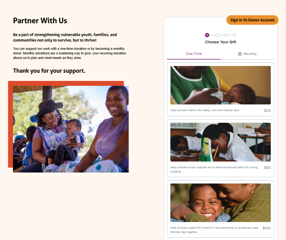
Kuda Vana Partnership uses a multistep form and elevates it to another level by incorporating impactful images. Each suggested donation amount is accompanied by an image of a child in need, helping donors put a face to those served by Kuda Vana.
These images incite an emotional connection with supporters, motivating them to give even more to your cause. Each donation amount also includes a description of the gift’s impact, further highlighting to donors the tangible benefits of their support.
ASK Childhood Cancer Foundation
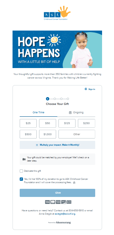
From the top of ASK Childhood Cancer Foundation’s donation page, you can see that the form is effectively branded with a logo and header reminding donors of the core mission. Additionally, they include a statement about exactly how many families donors’ contributions will help, allowing them to connect their donations to real impact.
Additionally, this donation form allows donors to check their matching gift eligibility directly within the form itself. That way, donors can double or even triple the impact of their gifts without having to give more or leave the page.
Boys & Girls Clubs of Napa Valley (BGC)
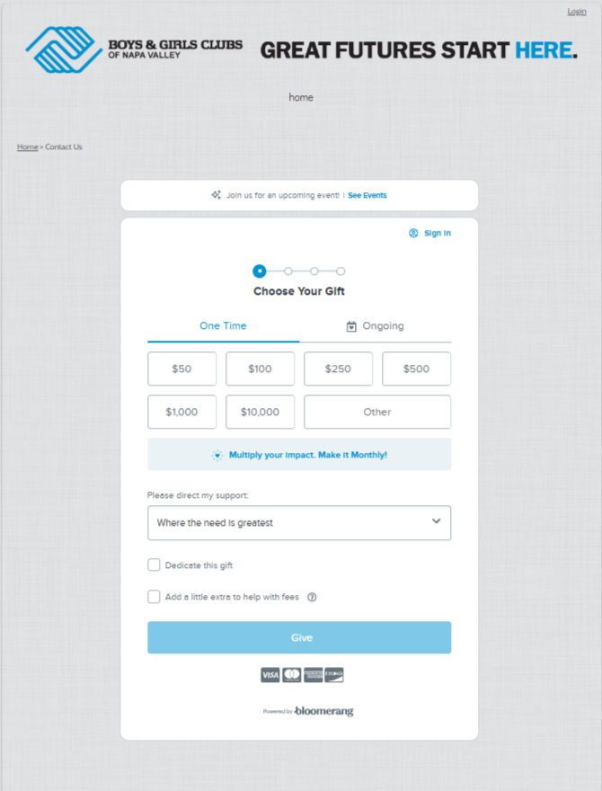
The Boys & Girls Clubs of Napa Valley’s donation form matches the branding for the rest of their site and donation page seamlessly, reassuring users that they’re in the right place. At the top of the form, there’s a link to the organization’s events page, which gives supporters another way to get involved. Lastly, the “Please direct my support” dropdown field allows donors to choose where they want their donations to go so they can actively make the impact they seek.
Oregon FFA Foundation
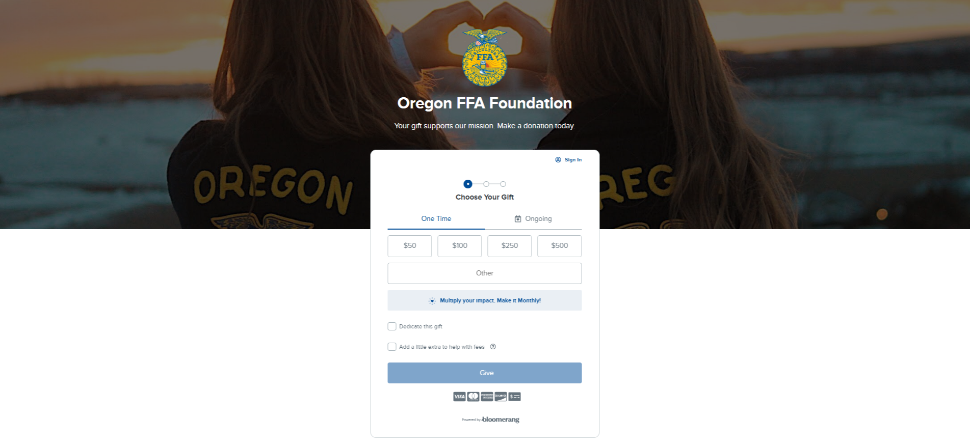
Oregon FFA Foundation’s donation form includes a checkbox for donors to dedicate their gift in honor of a loved one. When supporters click the box, they’re prompted to choose the type of dedication and who they want to dedicate the donation to. They can also send a message to the person they’re contributing on behalf of.
This donation form also includes a checkbox to cover donation processing fees. When supporters click their donation amount, the checkbox automatically updates, telling them exactly how much they’ll pay to cover those additional costs.
Colorado Music Festival
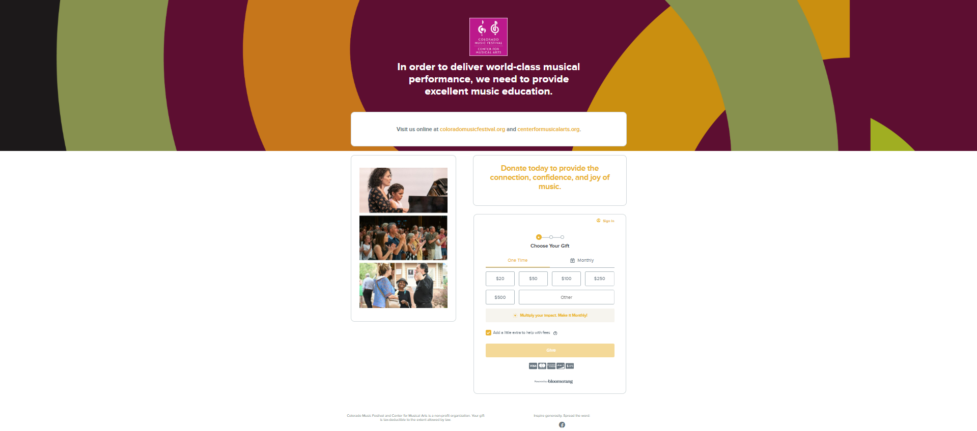
The Colorado Music Festival has configured the rest of its donation page to match the styling of the donation form, fully integrating the form into the page and offering a seamless giving experience. Next to the form, there are pictures of the music festival in action, showing donors the work they’ll support.
The form also includes a monthly giving box that encourages supporters to give on a recurring basis to multiply their impact. From there, users switch to the monthly giving portion of the form, where they can set up an ongoing contribution.
Proof Alliance
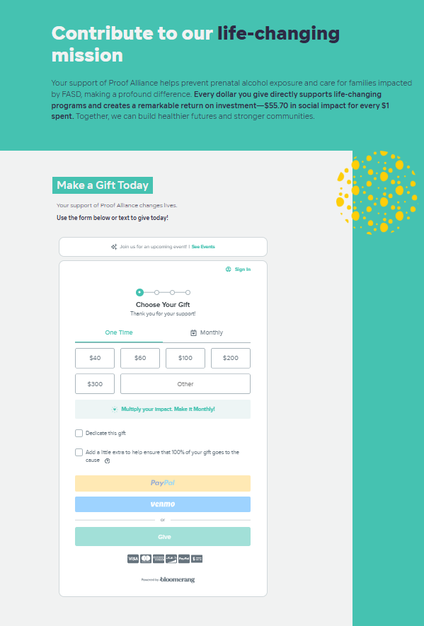
Above their donation form, Proof Alliance notes the exact return on investment (ROI) for donors’ contributions, showing them just how impactful their donations will be. It then transitions into a form that also explains that donors can give via text if they prefer.
Proof Alliance also offers a checkbox for donors to cover processing fees that explains the purpose behind it. By explaining that donors can “Add a little extra to help ensure that 100% of your gift goes to the cause,” they underscore the importance of offsetting these costs and encourage donors to opt in.
Final thoughts
Donation forms are the backbone of any online fundraising campaign. You can tell the best stories, share the best images, and write the best appeals… but they can’t succeed if you don’t have a donation form that encourages conversions. By keeping your form short and simple, making your pages mobile-friendly, and adhering to the other best practices above, you’ll reduce form drop-off and secure more donations.
If you’re looking to completely revamp your donation form, look no further than Bloomerang Fundraising. Our donation form tools help thousands of nonprofits increase conversions and fuel their causes. Optimize your donation form with our:
- One-click donation options
- Abandoned gift recovery
- AI-optimized gift suggestions
- Automatic pledge payments
- Recurring giving nudges
- Matching gift integrations
- Drag-and-drop branding
Request a demo today to get started with Bloomerang Fundraising! If you want to learn more about collecting donations before getting started, check out these additional resources:
- How to create a donation page that catapults fundraising. Ensure your entire donation page maximizes revenue with this guide.
- Top 10 nonprofit credit card processing tools for 2025. Securely process donations with these credit card processing tools.
- Mobile giving crash course: essential guide for nonprofits. Empower supporters to give from their mobile devices with the help of this mobile giving crash course.
You might enjoy

Top 10 nonprofit credit card processing tools for 2026
Nonprofit management


How to create a donation page that catapults fundraising
Online donation forms