Share this article
Over the past few years, the web has evolved at a rapid pace.
It’s important that your nonprofit stays up to date on the latest nonprofit website design trends so that your online fundraising efforts stand out from the crowd and bring in more donations.
Today, we’re going to take a look at a handful of do’s and don’ts for your website that will help you create a donor-friendly experience. The more user-friendly your site is, the more likely donors are to return again in the future!
To skip down to either section, click on the navigation below:
Now let’s get started!
Nonprofit Website Design Don’ts
1. Don’t Hide Your Donation Button.
While your website shouldn’t scream, “GIVE US MONEY!”, your donation button should be readily apparent to anyone who arrives on your website, whether it’s for the first time or the hundredth.
Include a “Donate Now” button above the fold on every single page of your website and blog.
The fold is the part of the webpage that stays at the top of the page, even when a visitor is scrolling up and down.
Keeping your donation button above the fold ensures that no matter where someone is on your website, they can immediately make a contribution if the fancy strikes.
Many websites do this by placing the donation button in the top navigation so that it’s always visible. As an added bonus, your nonprofit won’t have to manually add the donation button to every page!
2. Don’t Use Flash.
Once upon a time, Flash ruled the web. It became popular through its use of video, animation, audio, and movement to make websites more interesting.
Today, Flash is not supported on many mobile devices, so lots of donors won’t even be able to see your site if they visit from a phone or tablet.
Most online fundraising software and open source platforms will use HTML or CSS (quick, easy alternatives to Flash) instead.
If your nonprofit is building your own website, it’s important that you make it as donor-friendly as possible, which means leaving Flash in the past.
3. Skip The Splash Page.
A splash page is a page that a user sees before they can access a website. Splash pages usually feature a “continue” button that then takes the donor to the homepage.
Splash pages create one more unnecessary step for donors to access your website’s content.
If donors cannot access the content they need within a couple clicks after arriving on your site, they will most likely abandon it and look elsewhere.
4. Don’t Use Self-Playing Audio or Video.
One of the biggest pet peeves for donors is visiting a site and having audio or video play without knowing where it’s coming from or how to make it stop. Plus, sudden audio can be quite jarring for donors who aren’t expecting it!
Audio and video content can be great assets for your nonprofit, but only if donors are in control of these features.
Ensure that donors have the ability to press the play button when they want to. Otherwise, they may be deterred from visiting your site.
Additionally, allowing donors to click on your video or audio content adds an interactive element to your website, which can keep them on the page longer.
5. Don’t Bury Your Most Important Content.
When donors get to your website, you want to make it an incredibly easy and pain-free process.
As a general rule, the homepage should display your most important information upfront.
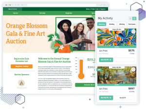
That means your nonprofit’s name and mission statement should be visible immediately. Additionally, a large, relevant image (called a hero image) should showcase your nonprofit’s cause.
Here’s an example of an effective landing page from Lakewood Service League:
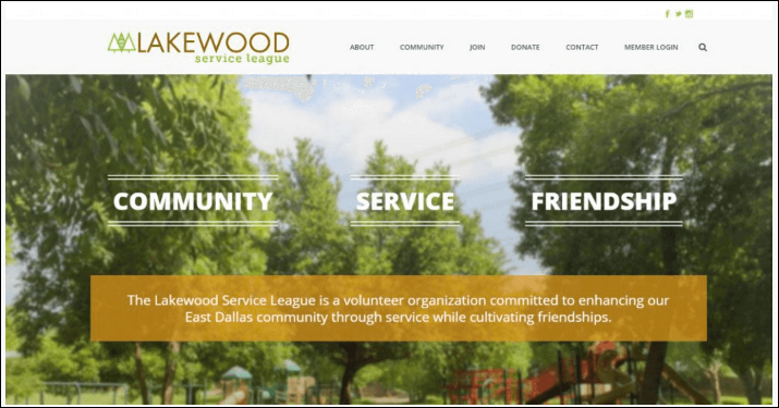
Burying this important information in your website can cause donors to bounce. After all, donors expect to see who your organization is and what you’re trying to accomplish as soon as they click on your website.
To determine what information takes precedence, rank your content by its importance. Doing so creates a content hierarchy and helps you decide where and how the content should be displayed to create a great user experience.
6. Don’t Forget About Mobile!
Visits from mobile and tablet donors have grown exponentially the past couple of years. Make sure your site is optimized for mobile and tablet devices so that on-the-go donors get an equally friendly user experience.
Here are some strategies for optimizing the mobile experience:
- Create large, easy-to click buttons.
- Ensure that data fields on donation forms can easily be filled out on a mobile device.
- Resize and compress images to optimize page speed.
- Use large, easy-to-read fonts.
- Ensure that donors don’t have to resize your website by zooming in or out on a mobile device.
- Check that your content aligns vertically in a mobile format.
Now that we’ve talked about what not to do (and how to remedy those problems), let’s discuss how you can create the best possible design for your nonprofit.
Nonprofit Website Design Do’s
1. Incorporate Easy-to-Use Navigation.
Website visitors should be able to find out exactly how to use your website’s navigation within a few seconds of landing on the page.
To do so, include navigation at the top of your website or in a static menu on the side of the page.
Here’s an example of an effective side menu from Our House:
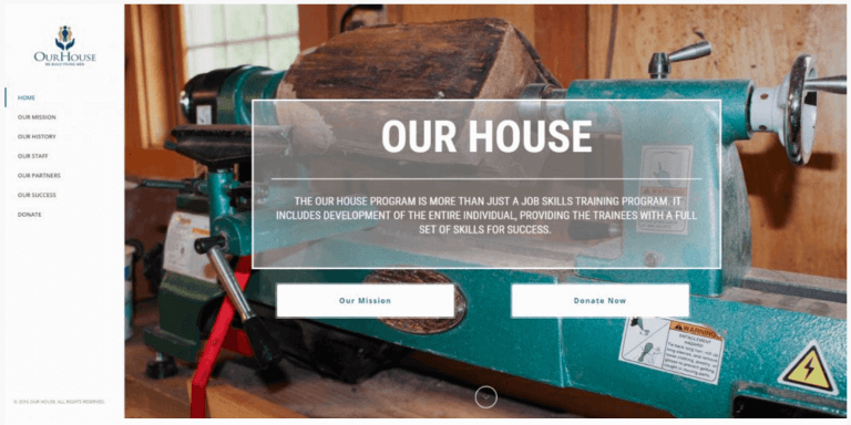
If you have subnavigation within your main menu, be sure that the most important pages are displayed on your main navigation. For example, you wouldn’t want donors to have to click or hover their mouses to find your donation page. However, a subnavigation could be a great place to direct donors to your event calendar.
Additionally, ensure that donors can clearly understand where each menu item will take them. Use short, concise, and accurate language when directing visitors to pages (i.e. Home, About Us, Donate).
2. Tell A Story.
One of the best advantages of being a nonprofit is that you have a story to tell. Telling a story can connect donors to your cause and encourage them to take action.
After all, donors are much more likely to give if they understand exactly who their donations will be helping and how their gifts further your cause. Stories make your cause tangible to donors, so it’s important that you leverage your online tools to tell them as effectively as possible.
Your website is the perfect place to host a variety of visual and textual content that can guide your donors through your mission. The more emotional impact you can create, the better.
Use different types of media to tell your story, such as:
- Videos.
- Infographics.
- Photos.
- Testimonials and quotes.
- Case studies.
The point is that your website should invite donors to stay on your site and engage with your content.
Additionally, it’s important that your content is donor-centric. Show donors how they can be a part of your story by keeping the language focused on “you” (the donor) instead of “we” (the nonprofit).
3. Keep It Visually Interesting.
With so much interesting content online, your website needs to compete to grab donors’ attentions. Otherwise, they may bounce before they even learn about your cause.
Using interesting visuals can not only keep donors on your site for longer (which ultimately increases their chances of giving), but it also allows you to showcase your nonprofit’s story. A picture, as they say, is worth a thousand words.
Your website is a canvas; it’s important that you take advantage of the visual opportunities that you have so that you can create an awesome online experience for your donors. In turn, your donors are more likely to return to your site in the future!
Many website builders allow nonprofits to create pages without advanced knowledge of CSS or HTML. This advancement is great for nonprofit web design because your organization can more easily play with your website’s visual features.
Here are just a few elements that can add visual interest to your website:
- Custom fonts.
- Animation.
- Icons.
- Photos and images.
While all of these features can be used to enhance your design, it’s important that you don’t go overboard. Keep your donors focused on your cause by using these elements as supporting features only.
4. Make It Fast!
Your website’s speed is incredibly important. Donors are more likely to abandon a site that doesn’t load within a few seconds.
Here are few things you can do to keep your site fast:
- Optimize your site’s images. You can resize and compress your images with several free online tools.
- Properly manage and compress scripts and plugins.
- Don’t overdo it on custom webfonts.
Keeping your website fast will not only encourage donors to stay on your page, but it will also improve your ranking in search engine results.
5. Provide A Clear Call-To-Action.
One of the best things you can do to enhance the user experience on your website is to provide clear calls-to-action.
A call-to-action tells donors exactly how they can engage with your organization. Directing your website visitors gives them a stronger sense of purpose.
To really execute this step, you’ll want to provide a call-to-action for every type of supporter at every step of the giving process.
Here are a few ways to do just that:
- Always display your donation button. As we’ve discussed before, your donation button should be easily accessible on every page. Any visitor is a potential donor; the more easily they can access your donation form, the more likely they’ll be to give.
- Direct donors to more opportunities for engagement. Once a donor gives, they should be directed to a confirmation page. On this page, you can call donors to register for a fundraising event or schedule a volunteer opportunity. Doing so keeps donors invested without pestering them for more money.
- Encourage new supporters to learn more. Call supporters to sign up for email newsletters or other informative materials on your website’s informational pages (such as an “About Us” page). New visitors who are looking to learn more about your nonprofit may appreciate the chance to get to know who you organization is before they decide to make a donation.
Consistent calls-to-action for different purposes can keep supporters focused and engaged no matter their reasons for visiting your site.
6. KISS: Keep It Simple and Straightforward.
You may have heard another version of the KISS acronym, but we don’t think you’re stupid at all. In fact, keeping up with the most current nonprofit website design tips is one of the smartest things you can do to improve your online fundraising strategy.
Overall, keeping your site’s design simple will create more presentable, readable, and interesting content.
Follow these tips to ensure that your site is as donor-friendly as possible:
- Choose a simple color scheme. Sticking to only 2-3 bright colors and emphasizing them with a few classic neutrals will keep your pages focused and clean.
- Keep text readable. Avoid long paragraphs (nothing over 5 lines or 3 sentences). Visitors aren’t likely to read tons of text to get to the point.
- Display fonts clearly. Light fonts should be displayed against dark backgrounds and vice versa. Sans serif fonts are the most readable on screens.
- Use white space. Don’t cram all of your content together. Use white space so that each element can “breathe.”
- Less is more. Your website is a place to inform visitors about your mission, engage supporters with mission-furthering opportunities, and accept online donations. Anything that deviates from these three main goals could be an unnecessary distraction.
A simple, effective page is your greatest asset for converting your visitors into online donors.
Further, a simple design keeps your website looking modern for longer. The more modern your website appears, the more credible it will seem to donors (especially as design trends change!).
As a final point, a simple, long-lasting website is more cost-effective in the long run, because you won’t need to spend as much time and resources on updating your look.
7. Make Your Donors Feel Secure.
One of the most important considerations in your nonprofit’s web design should be security. After all, donors want to know that their sensitive financial information will be safe with your organization.
Online giving requires that donors enter their credit card or bank account information; fulfilling these requirements in cyberspace can be intimidating to some donors!
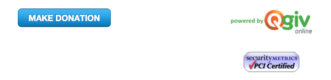
Reassure donors by putting security logos on your online donation forms. A PCI-certified logo shows donors that your payment processor is PCI-compliant.
Here’s an example from Qgiv:
If your donors know that your website fits industry standards, then they’ll be more likely to trust your nonprofit.
For comprehensive information on PCI-compliance, you can check out this resource.
8. Highlight Matching Gifts
Matching gifts are an easy way to raise twice as much as you would normally. With matching gifts, your nonprofit will receive the donor’s gift, as well as an additional donation from the donor’s employer. Matching gifts are usually given on a 1:1 ratio, but they can go as high as 4:1.
Matching gift tools allow you to easily integrate this additional opportunity to fundraise into your website design. Furthermore, adding this element can inform donors of the opportunity to seek out matching gifts in the first place!
Take a look at this donor-friendly design:
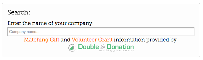
Using matching gift tools can add an interesting, interactive feature that ultimately results in more money for your nonprofit!
Bonus: Consider Responsive Design.
Responsive design takes your existing site and optimizes it for mobile and tablet users, which eliminates the need for a separate mobile site.
If you want a good example of what that looks like, resize your browser window and see how our website is optimized at smaller browser resolutions!
Or, read up on how Qgiv can help you create awesome, mobile-friendly websites with our comprehensive guide!
Now that we’ve covered these important nonprofit web design tips, it’s time for your organization to apply what you’ve learned.
Check out more design tips with this helpful article, or get started with Qgiv’s responsive, comprehensive online fundraising software.
You might enjoy
30 most effective nonprofit software solutions for 2026
Nonprofit management

15 sponsorship letter templates to spark new partnerships
Donor acquisition and retention