Share this article

Emily Friedrichs is the Communications and Content Marketing Manager at Elevation, a nonprofit digital services agency. She has been both volunteer and activist for organizations working on human rights, poverty elimination, non-violence, and cultural exchange. Emily has taught in underprivileged communities in New York and Buenos Aires. Her passions are community-building and behavioral psychology, and so she is excited to be working at their crossroads in nonprofit technology.
Donor relationships are key to our ability to realize our missions as nonprofits. All relationships are constructed by experiences, which means the experiences we create for donors matter. By improving our donation experience with these donation form best practices, we encourage giving and generosity. The donation experience begins long before someone writes a check or clicks a donate button. It encompasses donors’ interactions and emotions, as well as the context that surrounds them as they live these interactions and emotions. This means that donor experience includes a donor’s overflowing inbox or limited internet connectivity while commuting.
When it comes to your online donation experience, taking the time to optimize your donation page before your next giving campaign can have a real impact on its success. Here’s a checklist of 10 ways to improve your online donation experience before your next campaign.
1. Mobile first!
Design your donation page to look great on mobile. Not only is mobile giving continuing to increase year over year, 41% of donors give in response to tragedies. The public increasingly uses their phones to view news, social media, and read email, which means they’re also using their phones to search for ways to contribute to a cause or click through a cause marketing CTA. Make sure you’re primed to receive these donations.
2. Be strategic about where you ask for donations
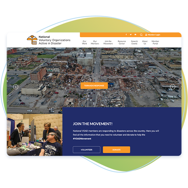
An online donation never starts on the actual donation page. It begins on your website homepage and related landing pages. Normally you’ll want to keep your donate button static in the top right corner, because this is what people expect to see and makes it easier for them to donate. But you can also be strategic about where you ask for donations. For example, maybe your site visitor is reading about your impact and is inspired by all that you do and then makes the decision to donate; make it easier for them!
3. Educate your donors while they’re motivated
Donors that give via peer-to-peer or shopping for a cause might not be as patient, but donors that come to a donation page from your website navigation are motivated. Use the opportunity to educate them and make the argument for your preferred giving method. For most nonprofits, this means monthly giving.
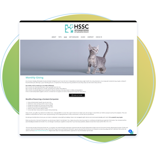
Once website visitors have read a little about your monthly giving program, direct them to the donation form. Now these visitors will be more likely to join as recurring donors. For campaigns and other donate CTAs where it would be inappropriate to include so much additional information, send people directly to the donation form, as the Humane Society of Sarasota County does.
4. Embed your donation form onsite
Embedding your donation form on your website, as opposed to linking out to an external site, increases users’ confidence that their donation is going to your organization. Embedding also improves your SEO and your nonprofit’s online visibility. You’ll first need to make sure your entire site is SSL secure–signified by an https:// or a closed lock in the URL–so that credit card information (along with other personal information) can be transmitted safely across your web server.
5. Keep your form simple
The above example also does a great job of simplifying their donation form. There is nothing less appealing than a long form that feels like a job application. Think carefully about your form fields and don’t overwhelm your donor. Break the form up wherever possible so that it doesn’t feel tedious and becomes more interactive, like the example above.
6. Embed all your other content too
If you decide to include evidence of your impact on your donation page, embed the content so that donors who want more information don’t navigate away from the donation page. Videos and infographics are ideal because they are more engaging and easy to insert. Whatever you do, make sure content doesn’t distract from the task at hand by being too time-consuming.
7. Remove competing CTAs
If you must include information about additional ways to support your organization, don’t use calls-to-action (CTAs). You want to minimize decision fatigue by offering an obvious decision path. The Land Conservancy of New Jersey provides email address and phone numbers for questions related to stock, matching, and tribute gifts without emphasizing these actions that don’t apply to the vast majority of donors. The secondary information is included below the donation form to make it clear that these are additional options that are available for giving scenarios not covered by their donation form.
8. Eliminate the navigation bar
Take a tip from the pros and remove the navigation bar from your donate page. This further streamlines actions to minimize decision fatigue and subconsciously signals to your user that they shouldn’t click away. This page is different from any other page, and you don’t want distractions!
9. Demonstrate material impact
People will give more generously and feel even better about the impact of their donation when they can associate a material impact with their gift. Consider adding this information, although you’ll still want to keep your form short and simple. Try to edit out as much text as possible. More preferable than listing this information in your form would be to share it on the page via an image or table of what each giving amount makes possible.
10. Prioritize your After donation experience!
Most organizations overlook the thank-you page. Remember that donors are most motivated by the feeling they get after donating, so this is a crucial moment to reaffirm the impact of their donation.
Use powerful imagery that reassures donors that their gift is going to make a difference. Choose images with expressive faces and where the person appears close to increase how much the viewer connects to the image. The body language and gaze of the person in the image will determine what people look at next.

For the thank-you page above, the child seems to be addressing the viewer while pointing to the tailored thank-you message. The combined effect feels highly personal and moving.
In addition to your thank-you page, always include an email receipt to build credibility and make your donor feel safe. The email receipt can include information about what the donation helped your organization to achieve, even if it’s just pulling from your annual report, i.e. “Thanks for your gift of $35. With help from donors like you, last year 35 families moved into permanent housing. This year we hope to help even more!”
From donors’ initial impulse to the rewarding feeling they get after giving, these 10 tips will help you to create a more impactful online donation experience. Combine them with general best practices for a website that attracts more supporters to transform your giving this year!
About Elevation

We value relationships and are proud to connect nonprofits to our partner network and hope this helps increase your nonprofit’s effectiveness and success. We proudly partner with Elevation, a full-service digital agency created for nonprofit organizations and the social sector.
You might enjoy

Donor segmentation: how to power stronger communications
Donor acquisition and retention

15 sponsorship letter templates to spark new partnerships
Donor acquisition and retention

How to write a meaningful donor thank-you letter
Donor acquisition and retention